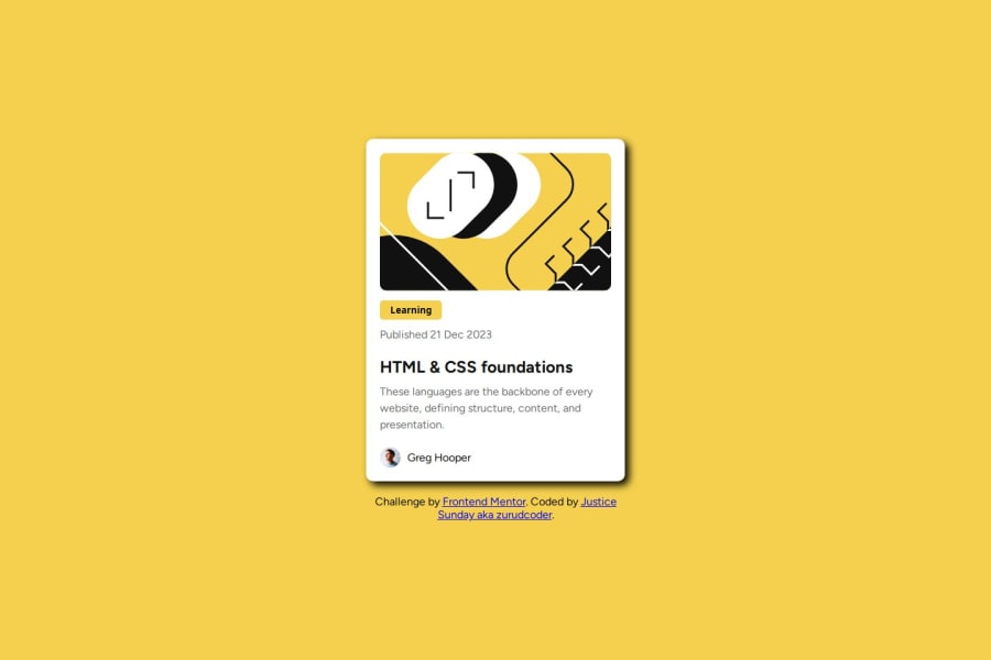


Design comparison
SolutionDesign

Solution retrospective
What are you most proud of, and what would you do differently next time?
I was able to accommplish the task and I will try to finish the task in a shorter time next time.
What challenges did you encounter, and how did you overcome them?the challenge I encountered was on how to apply the shadow so ass it concentrate more on the right. I played with the figure and I got it.
What specific areas of your project would you like help with?I just want a honest review
Community feedback
- P@makogeborisPosted 3 months ago
Great work, Here's a few things to review
- Remove the
height: 100vh;from themainbecause it limits the content especially on small screen sizes and addmin-height: 100vh;on the body. - Remove the
width: 100px;on thebodyand add some padding. - The
max-width: 1440px;on the .container is not ideal, change it to aboutmax-width: 20.4375rem;and remove themin-widthdeclaration. - This is an ideal box-shadow value for the .container to get it as close as the design
box-shadow: 0.5rem 0.5rem 0 #000000;
Hope this helps, Good luck!
0@zuru122Posted 3 months ago@mkboris okay sir, I will do tha. Thank you sir
0 - Remove the

Please log in to post a comment
Log in with GitHubJoin our Discord community
Join thousands of Frontend Mentor community members taking the challenges, sharing resources, helping each other, and chatting about all things front-end!
Join our Discord