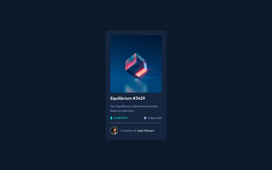
Design comparison
Solution retrospective
Goodevening or goodmorning whetever you are. Starting jurney with frontend technologies.If you can leavea comment and add something usefull please do it. Thanks to all of you.
Community feedback
- @vanzasetiaPosted almost 3 years ago
👋 Olaf Ziorko!
🎉 Congratulations on finishing this challenge! I have some feedback on this solution:
- Accessibility
- Create a custom
:focus-visiblestyling to any interactive elements (button, links,input,textarea). This will make the users can navigate this website using keyboard (Tab) easily. - All
imgtags should havealtattribute (even though it is empty) or else it is not a valid HTML. - Use the person's name for the alternative text for the avatar.
- The equilibrium image should be wrapped inside an interactive (
buttonora), since it has active states and it will do something if the user clicks the image, for example, it previews the image. - Also for both of these elements, wrap those text with anchor tags.
- Create a custom
<h1> <a href="#">Equilibrium #3429</a> </h1> ... <p> Creation of<a href="#">Jules Wyvern</a> </p>- I would recommend always wrapping all text with meaningful tag (
p).spananddivshould be only used for styling purposes. - I would think of this card component as the part of a large or full website, meaning that it should be all in one element (in this case
main). There's no needheaderandfooter(except for your attribution). - Visual
- Don't limit the height of the
bodyelement, it will not allow the users to scroll the page if the page content needs moreheight(see the issue on mobile landscape view). Usemin-heightinstead. Also, you don't need to set anyheighton thehtmlelement, treatbodyelement as your web page. - I would recommend setting the
bodyfont size withremunit. Using percentage as thebodyfont-size unit is useless since you are usingremwhich is relative to the root (html) element notbodyelement. After knowing this fact, I would recommend not setting thehtmlfont size to62.5%, since it can cause a lot of issues and almost no benefit at all. See what an accessibility expert has said about it.
- Don't limit the height of the
That's it! Hopefully this is helpful!
Marked as helpful1 - Accessibility
- @eleswastakenPosted almost 3 years ago
Good job!
When you see something that changes states on the design, it almost always means it is supposed to be interactive. It could be a button, or a link, or any kind of interactive element. So in your case, you would expect the preview image or card title to take you somewhere, to the Learn more about... for instance. The same is true for the profile elements, the name and avatar; again you would want to learn more about the author when you clicked on it. So make the image container, title, author's name and profile pic links.
Also when doing challenges like these, remember that they are part of a bigger webpage, meaning the layout should be done accordingly.
Good luck!
Marked as helpful0@OlafZiorkoPosted almost 3 years ago@eleswastaken Thank you mate.I going to implement you advice to the next projects!Once again THANK YOU!
0 - @nofeesahdeePosted almost 3 years ago
Hi Olaf, great job. However, you should include alt text into your image to improve accessibility
0@vanzasetiaPosted almost 3 years ago@nofeesahdee Which image that you are talking about?
0
Please log in to post a comment
Log in with GitHubJoin our Discord community
Join thousands of Frontend Mentor community members taking the challenges, sharing resources, helping each other, and chatting about all things front-end!
Join our Discord
