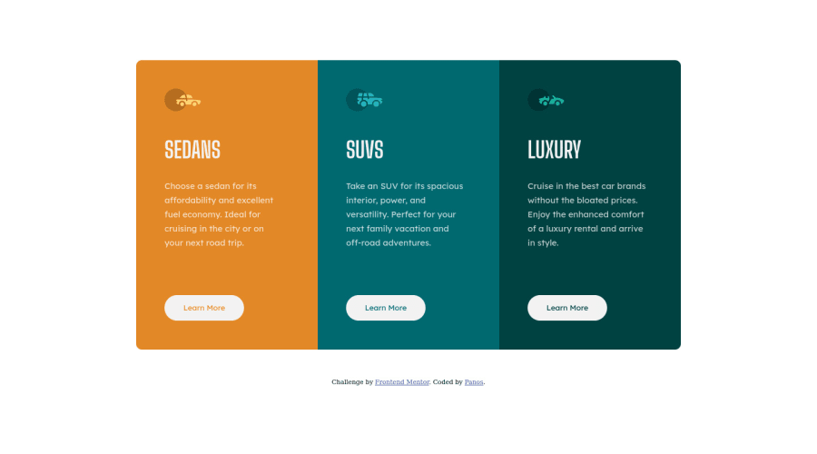
Design comparison
Community feedback
- @fatlindshehuPosted over 2 years ago
Hi @panosjapan7
Your component looks great, I would recommend some improvements:
- Adding a
paddingtomainin order to avoid the overflow from the browser, make sure to adapt the padding corresponding to the device's screen size. - Using a pre-processor like SASS or LESS would be also very nice, for bigger projects, pre-processors make the code reusability and maintenance very easy and also reading your code from other developers is much easier.
- I would suggest using rem or em units, instead of pixel units, px can cause Issues when trying to make your site/component responsive.
Keep up the good work!
Marked as helpful1@panosjapan7Posted over 2 years agoHi @fatlindshehu ! Thank you for the feedback.
-
Nice tip about giving margin to the main tag.
-
I've used SASS in the past. It just feels like overkill for this kind of small projects. Still, good suggestion.
-
I usually use em, but the brief says that the <p> text must be 15px, so I set the rest of the text in px as well.
Again, thank you so much for the suggestions!
Panos
0 - Adding a
- @correlucasPosted over 2 years ago
👾 Hello Panos, congratulations for your solution!
Your design seems fine, but the component responsiveness isn't working at all due the
widthvalue you've set fixed inside the <p>, the.containerand each card size. Instead just change thewidthvalue formax-widthto allow the container and the cards to contract when the windows gets smaller..cardsContainer { display: flex; flex-direction: row; /* height: auto; */ max-width: 900px; border-radius: 10px; overflow: hidden; } .card.three, .card.one, .card.two { background-color: hsl(179, 100%, 13%); max-width: 320px; height: 510px; } .description { color: hsla(0, 0%, 100%, 0.75); font-family: 'Lexend Deca', sans-serif; font-weight: 400; font-size: 15px; line-height: 25px; max-width: 210px; margin-bottom: 80px; }Hope it helps you bro!
Marked as helpful0@panosjapan7Posted over 2 years ago@correlucas Hi Lucas!
Thank you for your input.
I was only looking at the desktop view and the mobile view (max-width: 375px) and didn't check how it behaves between those resolutions.
Thank you for the really nice tip. Your does help with responsiveness a lot but the cards' width become too small in mobile view. What's the best way to adjust this?
Here's how my solution looks in mobile (left) and how it looks after I applied your solution (right).
1@correlucasPosted over 2 years ago@panosjapan7 Hey, I just looked again your solution and I saw why happen this alignment right.
.cardContainer { margin-top: 50px; margin-left: 50px; }See that you've add margin only top/left, add a single margin for all the container to keep the elements with the same margin around like
margin: 50px;I think this solve the alignment problem.I've done a test and works.
Marked as helpful1@panosjapan7Posted over 2 years ago@correlucas Oh, man... So simple and yet I couldn't see it. I hate when that happens! haha
I updated my GitHub repository with your suggestions.
Thank you so much.
1@correlucasPosted over 2 years ago@panosjapan7 You're welcome Panos.If you want to see my solution for this same challenge, here it is: https://www.frontendmentor.io/solutions/3-column-preview-card-vanilla-css-custom-design-and-hover-states-e5uAfmUT71
I was able to say you some issues, because I lose some time doing this challenge, so I was familiar to this component hahaha
Keep coding.
Marked as helpful1
Please log in to post a comment
Log in with GitHubJoin our Discord community
Join thousands of Frontend Mentor community members taking the challenges, sharing resources, helping each other, and chatting about all things front-end!
Join our Discord
