Not Found
Not Found
Not Found
Not Found
Not Found
Not Found
Not Found
Not Found
Not Found
Not Found
Not Found
Not Found
Not Found
Not Found
Not Found
Not Found
Not Found
Not Found
Not Found
Not Found

Submitted

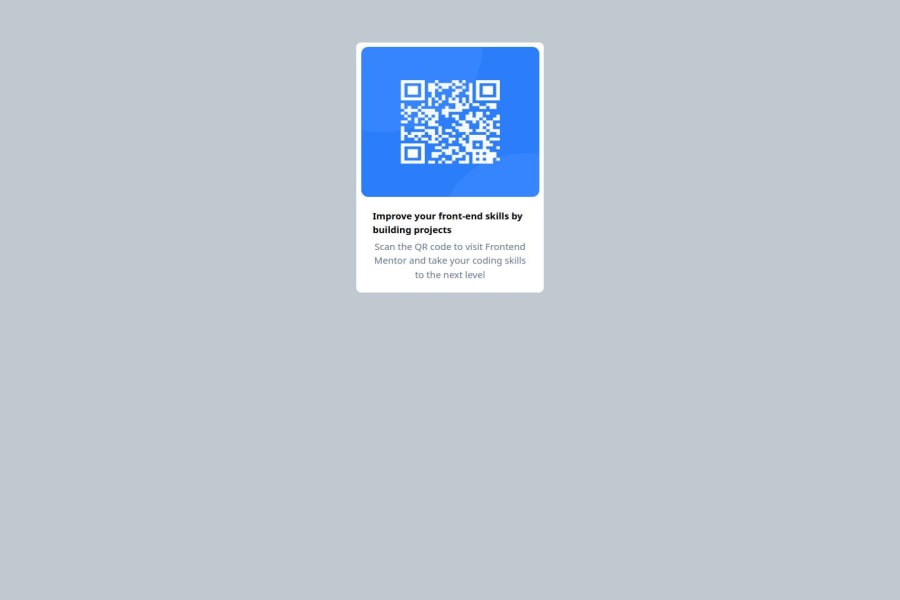
Responsive card layout using React,Tailwind CSS and Vite

@matthewkuria

Desktop design screenshot for the QR code component coding challenge

This is a solution for...

  • HTML
  • CSS
1newbie
View challenge

Design comparison


SolutionDesign

Solution retrospective


What are you most proud of, and what would you do differently next time?

I am very proud that I have been post poning to attempt the challenge but I have done the challenge successfully within the shortest time I could believe.I have used a div for the card component but next time I will use a styed component from either Material UI or ShadCN so that I take less time coding.

What challenges did you encounter, and how did you overcome them?

I experienced a challenge getting the actual size of the card & image height and width.I overcame by really analyzing the mobile and desktop design.

What specific areas of your project would you like help with?

Some help getting the actual sizes of the images from the design will be appreciated.

Community feedback

@TedJenkler

Posted

Hi @matthewkuria,

Just for fun, I’ll tell you about another way to center a div using Tailwind classes: set the parent div with relative and the child div with absolute. Then, apply top-1/2 and left-1/2 to the child, along with transform and -translate-x-1/2 -translate-y-1/2. While using flex with justify-center and items-center is generally better, this is still a useful technique!

I also noticed you’re using too many containers in React. You can avoid this by using fragments (<> </>) when a div isn’t necessary. Remember that both HTML, body, and #root can be styled directly, so extra containers are often unnecessary. For text inside a card, instead of using a div, you can simplify it by using flex flex-col to make your code cleaner.

Keep up the great work!

Best, Teodor

Marked as helpful

1

@matthewkuria

Posted

Hi @TedJenkler, Wow! this is new way to me...I don't know much about Translate-x and y in TailwindCSS ...It will be great to explore the insight...thank you so much for your time and the awesome insight!

1

@SvitlanaSuslenkova

Posted

You can use figma to measure design images.

body { display: flex; flex-direction: column; justify-content: center; align-items: center; min-height: 100vh; } Try this to align(top-bottom) and justify(left-right) your project to the center. It applies to the parent component(body), don't forget about min-height. You can use grid instead of flex too(with some changes). Hope you found this comment helpful :)

Marked as helpful

1

@matthewkuria

Posted

@SvitlanaSuslenkova Thank you so much for your time and helpful comment...Let me re-style the body again using your insight.I have used flexbox but let me try the grid.

0

Please log in to post a comment

Log in with GitHub
Discord logo

Join our Discord community

Join thousands of Frontend Mentor community members taking the challenges, sharing resources, helping each other, and chatting about all things front-end!

Join our Discord