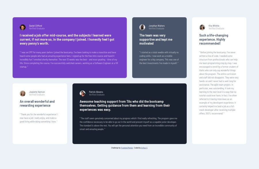


Design comparison

Solution retrospective
This was definitely tougher for me, I'm happy that I caught the difference between 100vh and 100% since these past couple projects got me so used to having 1 page, no scrolling projects.
What challenges did you encounter, and how did you overcome them?The main challenge was trying to think of the best way to handle different screen sizes. Should I have a mobile layout and a desktop layout? Should I do an intermediate layout with two grid columns (which is what I did)? Is there better way.
What specific areas of your project would you like help with?-
I'm not sure how to make the cards look consistent spacing-wise like in the reference because they have different amount of content. If one card has a smaller title then the paragraphs won't be perfectly in line. My assumption is that I should assign a width to the headers and paragraphs but that seems sketchy. Any advice would be nice.
-
Any advice on improving how I chose to handle the responsive layout would be appreciated as my abilities are very narrow and won't be able to know if there's an obviously better way.
Community feedback
Please log in to post a comment
Log in with GitHub
Join our Discord community
Join thousands of Frontend Mentor community members taking the challenges, sharing resources, helping each other, and chatting about all things front-end!
Join our Discord