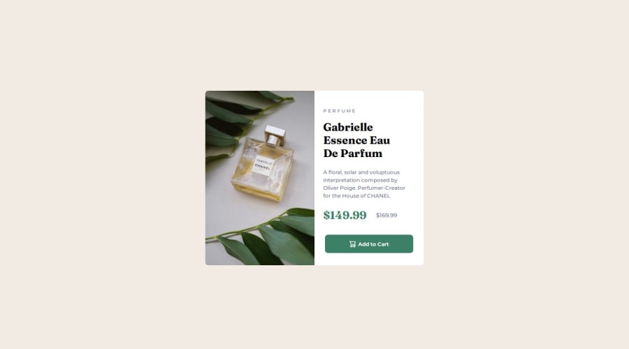
Design comparison
Solution retrospective
I developed it from just a screenshot. I'm proud of myself for that.
What challenges did you encounter, and how did you overcome them?Widths, height, font sizes are my main challenge. It's obviously due to the lack of figma desgn link.
What specific areas of your project would you like help with?A figma design file link would really help a lot.
Community feedback
- @CjsrodrigoPosted 11 months ago
Design looks amazing! As of the problem with the lack of the Figma design. Try not to stick with the use of pixel. using em/rem, makes everything work in proportion (and also helps a lot working with responsive layouts) Great job, keep it up!
0
Please log in to post a comment
Log in with GitHubJoin our Discord community
Join thousands of Frontend Mentor community members taking the challenges, sharing resources, helping each other, and chatting about all things front-end!
Join our Discord
