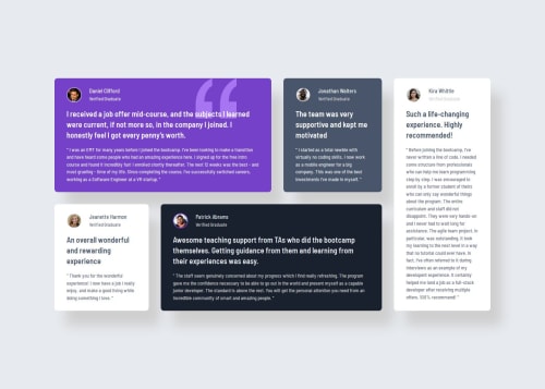
Responsive card grid using tailwindcss

Solution retrospective
- I'm proud of learning about the @apply directive.
- Next time I'd use grid instead of flex. Maybe it would be more appropriate for this project.
- I struggled to prevent Kira Whittle's card from overflowing around the laptop/tablet breakpoints.
- Ended up creating a ton media queries tweaking the flex gaps, paddings, etc., in order to leverage the space as much as possible. Also used min-width on it to prevent it from becoming too thin, as well as on the other two smaller cards.
-
Not sure if any of the points above are good practice or if there is a more optimal way. Feedback on this would be much appreciated!
-
For the quotation mark image, I used the <picture> element to hide it on mobile and absolute positioning and z-index to position it properly. This caused an issue with the alt attribute on mobile because then the alt text would show up, which is not intended. To fix this I just deleted the alt tag entirely which is no good, right? Should I have made it a background image instead? I guess that would have avoided some of these issues.
-
Also used z-index to avoid the card shadows to go on top of nearby cards, which seemed a bit odd.
Please log in to post a comment
Log in with GitHubCommunity feedback
No feedback yet. Be the first to give feedback on NunoJDMachado's solution.
Join our Discord community
Join thousands of Frontend Mentor community members taking the challenges, sharing resources, helping each other, and chatting about all things front-end!
Join our Discord