


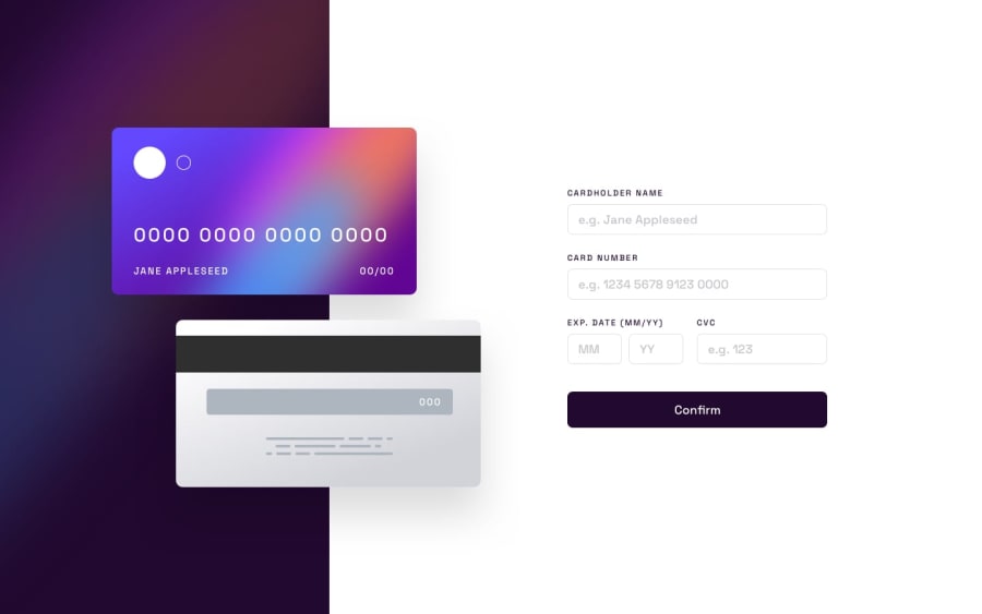
Design comparison
Community feedback
- @Ritika-Agrawal811Posted 11 months ago
Hey! Good work on the challenge
I saw your code and would like to share few points to help with responsivity.
- Use relative units, don't use pixels everywhere
It's best to use rem for font-sizes and em for other properties. em values are calculated relative to an element's font size and rem are calculated against a default browser size which is 16px in most cases. You may read more about it here.
Once you start using relative units your CSS code will reduce greatly. You won't have to use so many media queries too 🙂
- Don't set a max-width on body tag
I noticed that you have assigned a maximum width of body tag. Instead add that to the main tag.
Hope these points are helpful to you!
Marked as helpful0@Caiqu3wavPosted 11 months agoThanks, im startin with this and really want feedbacks and tips
0

Please log in to post a comment
Log in with GitHub
Join our Discord community
Join thousands of Frontend Mentor community members taking the challenges, sharing resources, helping each other, and chatting about all things front-end!
Join our Discord