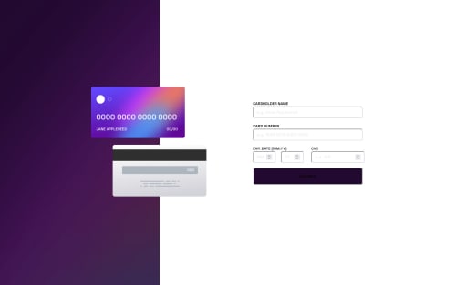
Submitted almost 3 years agoA solution to the Interactive card details form challenge
Responsive card details - React - Vite
react, vite
@Robertron624

Solution retrospective
What did you find difficult while building the project?
Properly positioning both the cards and its internal dynamic text. It was really hard finding the proper way to position them in the position the design wanted to be
Code
Loading...
Please log in to post a comment
Log in with GitHubCommunity feedback
No feedback yet. Be the first to give feedback on Roberto Ramirez's solution.
Join our Discord community
Join thousands of Frontend Mentor community members taking the challenges, sharing resources, helping each other, and chatting about all things front-end!
Join our Discord