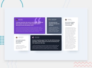
Design comparison
SolutionDesign
Solution retrospective
What are you most proud of, and what would you do differently next time?
able to get the right size for the card
What challenges did you encounter, and how did you overcome them?getting the right size for the card
What specific areas of your project would you like help with?any advice would do
Community feedback
- @adewalemudasiruPosted 4 months ago
Well done. Your design looks great but can be improved. The shadow is too bold and needs better alignment. You also missed some small details from the original design like the image border and colour for Daniel and Patrick cards. The quote svg on the first card is also not properly aligned. Overall you did great.
0
Please log in to post a comment
Log in with GitHubJoin our Discord community
Join thousands of Frontend Mentor community members taking the challenges, sharing resources, helping each other, and chatting about all things front-end!
Join our Discord
