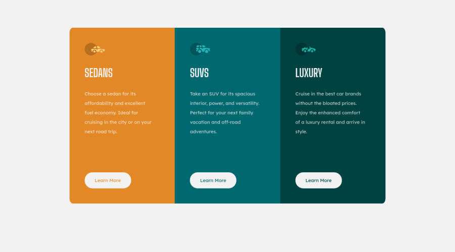
Design comparison
Solution retrospective
Hello everyone!
I found using CSS Grid to be very useful when completing this challenge! Did anyone else do the same or did yall do something different? I would love to know what approach yall used!
p.s. All feedback is welcome!
Community feedback
- @brumacosminPosted over 1 year ago
Hi,
Looking at your design I noticed a few things: -the component is not centered: you can solve this using flexbox: justify-content: center and align-items: center -you did not apply the hovering effect on the buttons: you can look at the design images to see what the page should look like in the active state -you need to fix the border-radius in the mobile version as they are currently messed up
- also, in the mobile version the whitespace between the text and the buttons should decrease.
Marked as helpful1
Please log in to post a comment
Log in with GitHubJoin our Discord community
Join thousands of Frontend Mentor community members taking the challenges, sharing resources, helping each other, and chatting about all things front-end!
Join our Discord
