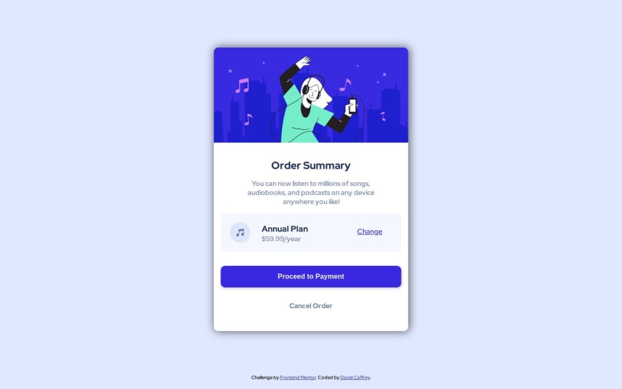
Design comparison
SolutionDesign
Solution retrospective
I feel my process is a bit laboured. Am I nesting my html to deep for such a simple component?
Community feedback
- @vanzasetiaPosted over 1 year ago
Hello, David Caffrey! 👋
Here are a few ways you can do to improve this solution.
- Remove
<div class="card-img-container">. Let the card element be the container of the illustration. - Leave the alternative text empty for the illustration and the music icon because they are decorative images.
- For your information, decorative images are images that do not add any information and serve only aesthetic purposes.
- Do not skip heading levels. In other words, heading levels must always be in order to give structure to a page.
- Learn more about heading elements — How-to: Accessible heading structure - The A11Y Project
<button>element must always havetypeattribute to prevent unexpected behavior. Source: Checklist - The A11Y Project #use-the-button-element-for-buttons
You do not need to use a media query to make the card responsive.
- Put the
max-width: 450pxon the base styling of.card-container. - Make the
<body>element the flex container of the card to put the card in the middle of the page on all screen sizes. Do not usemargin. - The width of the
<p class="info">should be controlled by thepaddingof the parent element,<section class="card-info-container">. No need to use a media query to control the text wrapping of the paragraph element.
Learn more about "responsive website": What does it mean to "make a site responsive"?
I hope this helps. Happy coding! 😄
0 - Remove
Please log in to post a comment
Log in with GitHubJoin our Discord community
Join thousands of Frontend Mentor community members taking the challenges, sharing resources, helping each other, and chatting about all things front-end!
Join our Discord
