Design comparison
Community feedback
- @rashmodPosted over 2 years ago
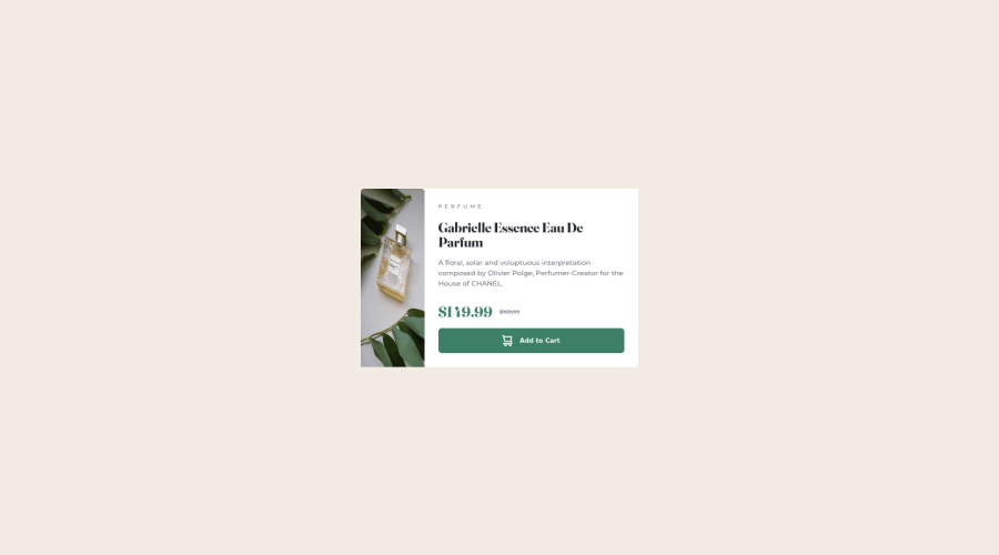
Why does the card in the screenshot look different from the actual hosted website?
0 - @gautamjuyalPosted over 2 years ago
I see that the media query in your code for viewport width 1440px has squeezed the image to 50% of its width, but I don't understand why have you even added media queries for viewport larger than 1440px? Instead set it to max-width:400px to suit a mobile screen, and then make favourable changes.
0@rashmodPosted over 2 years ago@gautamjuyal I'm not able to understand what you're talking about? I'll tell you what I get from this. There are no issues when on localhost and live site but there seems some problem with only the screenshot....?
0@gautamjuyalPosted over 2 years ago@rashmod I think you have now updated the code. Maybe try making a re-submission, that way the screenshot will be refreshed. Also, your component on the hosted site looks a little bit smaller, maybe also try scaling it up a little.
0@rashmodPosted over 2 years ago@gautamjuyal I have not updated the code but I did try to generate another screenshot but it did not help. And the size may be like that since I'm using a 14" laptop to make this. IDK.
0
Please log in to post a comment
Log in with GitHubJoin our Discord community
Join thousands of Frontend Mentor community members taking the challenges, sharing resources, helping each other, and chatting about all things front-end!
Join our Discord
