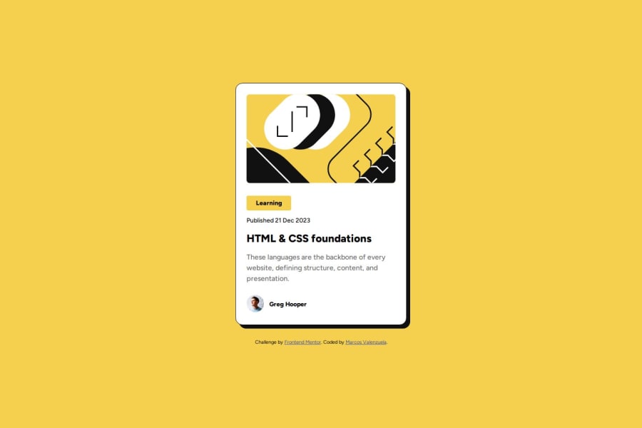
Responsive card component using CSS Flex and pseudoclasses
Design comparison
Solution retrospective
I liked the use of flexbox for the layout from the container to the child elements, sectioning with BEM.
What challenges did you encounter, and how did you overcome them?In the author element, I found that I could not reduce the size of the image with flex-shrink. I solved it by putting the image in a and it could be reduced without problems.
What specific areas of your project would you like help with?I would like help with CSS structure. I use Flex and utilities, but I am not clear if I have omitted some good practice or if it can be optimized in some way.
Community feedback
- @luizfbnPosted 6 months ago
Good solution. I found some stuffs that you can improve.
About HTML:
- You can wrap your img with figure tag: https://www.w3schools.com/tags/tag_figure.asp
- Inside content section, you can wrap the learning stuff and the publish date inside a header;
About style:
- The card shadow needs to be bigger;
- On card hover, the shadow needs to expand (you can see this on Figma's prototype presentation) and cursor needs to be pointer;
- The typography needs to be reviewed. For exemple, the card content paragraph have wrong font weight.
Tips:
- Always check if your solution is responsive, it's very important;
- Avoid using width and height based on percentage, it is very situational and if you don't use wisely, this can break your style on different screen sizes;
- Flex it's an awesome tool, but you don't need to use on everything. For this design, for example, you could use only blocks and inline blocks elements and you could be fine.
Good job and keep studying! :)
Marked as helpful1@MarcosAvgPosted 6 months agoI have reviewed your points and have added them to my code, you were right with the use of flexbox, and thanks for the semantic corrections, I am still getting used to the units of measurement and it costs me a little not to use percentages, but over time I hope to use them better.
Thanks for your review good day! @luizfbn
1
Please log in to post a comment
Log in with GitHubJoin our Discord community
Join thousands of Frontend Mentor community members taking the challenges, sharing resources, helping each other, and chatting about all things front-end!
Join our Discord
