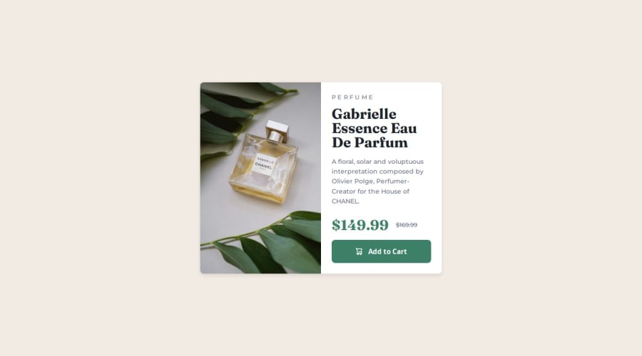
Responsive card component using BEM


Design comparison

Solution retrospective
I'm most proud of applying a mobile-first approach in this design. I found it easier than starting with desktop devices, as it helped me focus on the essentials and progressively enhance the design for larger screens.
What challenges did you encounter, and how did you overcome them?The main challenge was changing the image based on the device's resolution. I initially thought about using JavaScript, but after researching, I discovered the <picture> element, which allows me to achieve this functionality more efficiently.
I don't have any specific areas where I need help, but I would appreciate any advice or suggestions that could help me improve my code.
Community feedback
- @AldikrasniqiPosted about 1 month ago
You can follow my suggestions: make the font weight of description 500 if u using tailwind(text-md). Add some gap in the right col and padding in right col. Make the submit button less padding (padding: 0.8rem 0;)
1 - @MarziaJaliliPosted 20 days ago
A tiny suggestion:
I'm kinda planning to create a study group on Google Chats let me know if you're interensted to be added there. Let's beat Elon Musk together.
😂😂😂
Here's my email:
astronomyfancy@gmail.com
Throw me a hi on Google Chats, if you are willing to be a part of the devastation.
😎😎😎
0


Please log in to post a comment
Log in with GitHub
Join our Discord community
Join thousands of Frontend Mentor community members taking the challenges, sharing resources, helping each other, and chatting about all things front-end!
Join our Discord