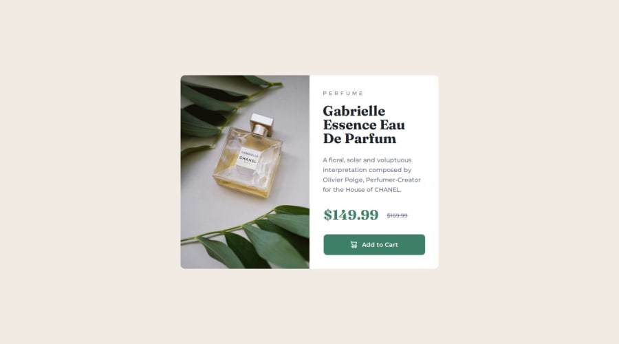


Design comparison

Solution retrospective
I put a lot of effort into making the site truly responsive, not only on the screen sizes that the challenge requested, but I tried to make the component responsive on intermediate sizes. I believe that over time I will learn good practices for responsiveness, especially some features and functions of the Flex-box.
What challenges did you encounter, and how did you overcome them?I had difficulty getting the texts to line up correctly with the image inside the component.
What specific areas of your project would you like help with?Good practices in responsiveness, Flex and how to deal with sizes and measurements correctly. If you can read the code and see what needs to change I would appreciate it.
Community feedback
- @manuelstolzePosted about 1 month ago
Wow you freaking nailed it!!! I'm really impressed!
One advice I can give you is that you should avoid naming your classes with numbers like you did with
.img1. Use more meainingfull names likeproduct-image.Marked as helpful0

Please log in to post a comment
Log in with GitHub
Join our Discord community
Join thousands of Frontend Mentor community members taking the challenges, sharing resources, helping each other, and chatting about all things front-end!
Join our Discord