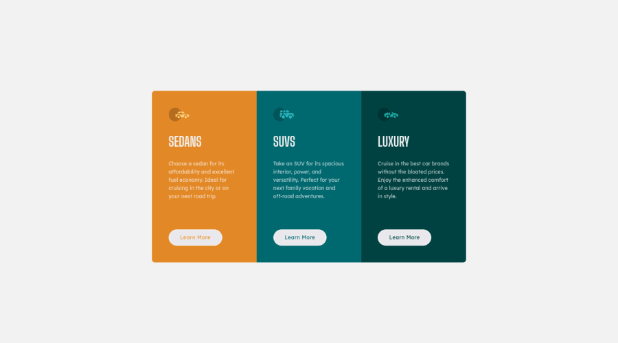
Responsive Card Component Built with HTML, CSS, SASS and Flexbox
Design comparison
Solution retrospective
I can tell you that I am proud of how far I'm getting as far as Web Development is concerned, my aim right now is to finish the HTML and CSS newbie challenges and I'm trying my possible best to make sure each component I code is better than the next and also close to the design given. Please I am very open to helpful feedback. 😎
Community feedback
- @Sdann26Posted over 2 years ago
Hi Kingsley!
If you want to vertically center your columns you could add to the body.
body {
  font-size: 0.9375rem;
  font-family: "Big Shoulders Display", sans-serif;
  font-weight: 700;
  background-color: #f2f2f2f2;
  display: flex;
  flex-direction: column;
  justify-content: center;
  align-items: center;
  min-height: 100vh;
}
These last 5 attributes generate the vertical centering :D apart we put a minimum height so that it gets bigger when it goes to mobile size.
Finally change all those h1 to h2, you shouldn't have more than one per page.
What will cause the doubt, then what do I do so that I don't get the frontend mentor error for not having an h1.
I could recommend you this sacred technique which is to add a h1 inside your <main> and give it the class sr-only which is so that the screen reader detects it but it does not appear in your flow and at the end you just add the following attributes:
.sr-only {
  position: absolute;
  width: 1px;
  height: 1px;
  padding: 0;
  margin: -1px;
  overflow: hidden;
  clip: rect(0,0,0,0,0);
  border: 0;
}
And with just this ready you should no longer have any accessibility errors.
If you have any questions you can ask :D!
Marked as helpful0 - @Bayoumi-devPosted over 2 years ago
Hey Kingsley,
- Using more than one
<h1>is allowed by the HTML specification, but is not considered a best practice. Using only one<h1>is beneficial for screenreader users.
---> Multiple
<h1>elements on one pageHope this is helpful to you... Keep coding👍
Marked as helpful0@didyouseekyngPosted over 2 years ago@Bayoumi-dev Hey bro, thanks for the feedback, I really appreciate the time you took out to look at my code, so this brings me to my question:
-
Considering the sedan, suv and luxury headings, if I made only one of them to be the h1, isn't that going to affect screen readers also? I'm still trying to get a hang of this accessibility stuff.
-
Is there any other way I could have styled the headings instead of using header tags?
-
Please how do I center this card component, it's really giving me headache, I tried using display:flex with align items and justify content but still it's looking like it's not working. The screenshot comparison is not even close.
0@Bayoumi-devPosted over 2 years ago@didyouseekyng I suggest you change all
h1toh2and to avoid this accessibility issue --->Page should contain a level-one heading, create oneh1element on your document and then hide it. this is what I did:<main class="card"> <h1>3-column preview card component</h1> <---- Add <div class="card__item card__sedan"> <img src="./images/icon-sedans.svg" alt="" class="card__item-icon" /> <h2 class="card__item-header">Sedans</h2> //... </div> <div class="card__item card__suv"> <img src="./images/icon-suvs.svg" alt="" class="card__item-icon" /> <h2 class="card__item-header">SUVs</h2> //... </div> //... </main>Give
h1the following style to hide it:h1 { position: absolute; opacity: 0; }You have used
flexboxto center the component on the page, but you need to set the height ofmain--->min-height: 100vh;to center it at this height:.card { display: flex; justify-content: center; align-items: center; min-height: 100vh; /* <---- Add */ }Marked as helpful0 - Using more than one
Please log in to post a comment
Log in with GitHubJoin our Discord community
Join thousands of Frontend Mentor community members taking the challenges, sharing resources, helping each other, and chatting about all things front-end!
Join our Discord
