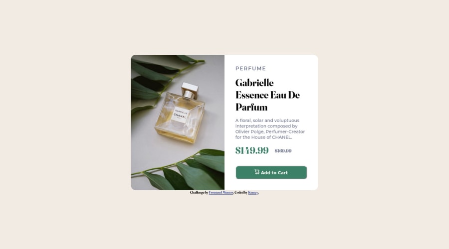


Design comparison
SolutionDesign

Community feedback
- @romila2003Posted over 2 years ago
Hi Kemcy,
Congratulations 🎉 for completing your second challenge, it was a great attempt but there was a number of issues I want to address:
- Regarding the responsiveness of your card, it looks great however the card between 376px to 600px, is quite high up and covers the whole width. A key solution for this problem, would be to take a mobile-first approach and change the elements as you increase the screen size since this would help you and is better in terms of best practices. Therefore, instead of giving the container a
media only screen and (max-width: 375px) { ... }, you should use themin-widthproperty instead, when you have reached 600px or 700px e.g.media screen and (min-width: 600px) { ... } - The button requires the
typeproperty e.g.<button type="submit" class="btn"></button> - The word 'PERFUME' should have the
letter-spacingproperty e.g.letter-spacing: 0.4em; - The description has the wrong
font-family. - Also, you should use the
flexproperty within the body to align the card in the middle e.g.
body  {
   display: flex;
   justify-content: center;
   align-items: center;
   min-height: 100vh;
}
Overall, great attempt and wish you the best for your future projects so keep coding 👍.
Marked as helpful0 - Regarding the responsiveness of your card, it looks great however the card between 376px to 600px, is quite high up and covers the whole width. A key solution for this problem, would be to take a mobile-first approach and change the elements as you increase the screen size since this would help you and is better in terms of best practices. Therefore, instead of giving the container a

Please log in to post a comment
Log in with GitHub
Join our Discord community
Join thousands of Frontend Mentor community members taking the challenges, sharing resources, helping each other, and chatting about all things front-end!
Join our Discord