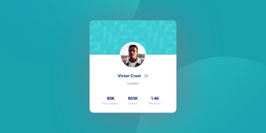
Design comparison
Community feedback
- @NaveenGumastePosted about 3 years ago
Hay ! Good Job Yashasvi Singh These are just my suggestions
These below mentioned tricks will help you remove any Accessibility Issues
-> Add
Maintag after body like it should be your container. For 1st heading orh1tag, use header tag and then inside the header put yourh1orh2etc . But use header tag only once in main heading element.-> You have use wrong color for the text
Keep up the good work!
Marked as helpful0@aUnicornDevPosted about 3 years ago@Crazimonk Thanks a lot Naveen, I will jump back and fix those issues ASAP 😄
1
Please log in to post a comment
Log in with GitHubJoin our Discord community
Join thousands of Frontend Mentor community members taking the challenges, sharing resources, helping each other, and chatting about all things front-end!
Join our Discord
