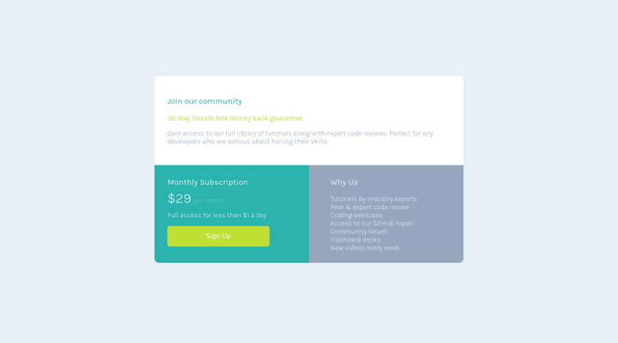
Responsive card built using html, css grid and javascript
Design comparison
Solution retrospective
Please corrections are highly welcomed
Community feedback
- @Nghuynh07Posted over 2 years ago
@HenryAgu First, great job on completing with the challenge. Keep up with the awesomeness. My only suggestion is avoid using fixed width. The web alone w/o css is responsive. By putting a fixed size on a container or an elements we're limiting to be responsive. I see this in your code:
main{ width: 50%; margin-left: auto; //margin: auto; will also do the trick here margin-right: auto; }
By setting a fixed width, the contents overflow. Responsive design uses max/min-width/height. Check out link below for a free 21 days course where kevin teaches you all you need to know about responsive design.
I hope this help. Have a good day
https://courses.kevinpowell.co/conquering-responsive-layouts
Marked as helpful0
Please log in to post a comment
Log in with GitHubJoin our Discord community
Join thousands of Frontend Mentor community members taking the challenges, sharing resources, helping each other, and chatting about all things front-end!
Join our Discord
