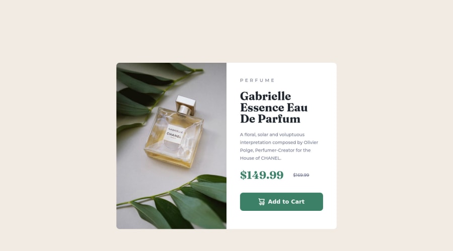
Design comparison
Solution retrospective
Hope I can get some advise on my work. Thank you!
Community feedback
- @correlucasPosted about 2 years ago
👾Hello Osama Salem, Congratulations on completing this challenge!
I saw your solution preview site and I think it's already really good. Here’s some tips for you to improve it:
A better way to work this solution image, the product image is by using
<picture>to wrap it on the html instead of using it as<img>orbackground-image(with the css). Using<picture>you wrap both images (desktop and mobile) and have more control over it, since you can set in the html when the images changes setting the screen size for each image.ote that for SEO / search engine reasons isn’t a better practice import this product image with CSS since this will make it harder to the image.Use units as
remoreminstead ofpxto improve your performance by resizing fonts between different screens and devices.To save your time you can code you whole page using
pxand then in the end use a VsCode plugin calledpx to remto do the automatic conversion or use this website https://pixelsconverter.com/px-to-rem✌️ I hope this helps you and happy coding!
Marked as helpful1
Please log in to post a comment
Log in with GitHubJoin our Discord community
Join thousands of Frontend Mentor community members taking the challenges, sharing resources, helping each other, and chatting about all things front-end!
Join our Discord
