Design comparison
Solution retrospective
I'm proud that I managed to do the challenge, it helps me a lot to measure my level of knowledge and gives me more confidence when doing things and reduces impostor syndrome a little.
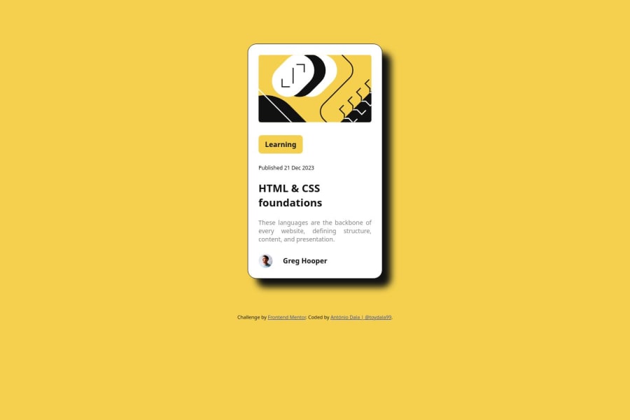
What challenges did you encounter, and how did you overcome them?The challenge I encountered was creating the drop-shadow effect, but I overcame it with a simple search on w3schools
What specific areas of your project would you like help with?I would like help when making pages accessible, what are the best practices and rules
Community feedback
- @LuciaVerdePosted about 1 year ago
Hi mate ! first of all, congrats on the completion of the challenge!
Although I am a newbie, I have some comments on your work that may be helpful:
-
Landmarks such as <header>, <nav>, <main>, <footer>, etc., are really important in terms of, for example, accessibility, SEO and semantic organization. It would be great to add at least a <main> on your code.
-
I am not sure if you were able to access the Figma project for this challenge because some measurements are not consistent with the design. For example, the card itself should have a width of 24 rem. Another thing I noticed, is that the box-shadow blur is too blurry, it should be reduced to 0. I think you would like to check the assets provided one more time.
Keep going ! You got this!
Marked as helpful0@toydala99Posted about 1 year agoHi @LuciaVerde! Thanks for your feedback, I'll review my code and make the necessary changes on it, your comment was helpful! keep going!
1 -
Please log in to post a comment
Log in with GitHubJoin our Discord community
Join thousands of Frontend Mentor community members taking the challenges, sharing resources, helping each other, and chatting about all things front-end!
Join our Discord
