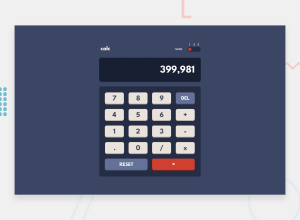
responsive calculator app with theme switcher
Design comparison
Solution retrospective
The nesting feature of sass/scss made designing the theme switching logic much easier and more organized since I only had to change the class on the body. I also liked how I was able to come up with the calculator logic
What specific areas of your project would you like help with?My current calculator is very limited. It can only work on two numbers at most and it doesen allo more than one number to have a decimal point. I guess I didn't plan properly for this but I would still like advice on how other people solved that problem. I would also appreciate advice on making the numbers appear with the commas automatically
Community feedback
Please log in to post a comment
Log in with GitHubJoin our Discord community
Join thousands of Frontend Mentor community members taking the challenges, sharing resources, helping each other, and chatting about all things front-end!
Join our Discord
