Design comparison
Solution retrospective
Hello! 👋
Any feedback will be appreciated!
Happy coding! 😁
Community feedback
- @elaineleungPosted about 2 years ago
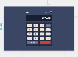
Hi Squashim, great work on this calculator challenge! I was playing around with it and anyway, things seems quite functional (including using exponential notation), which is good! Some quick comments for you:
-
I'm viewing this on my laptop, and the top and bottom are cut off; I also can't really scroll up to see the top. I tried changing the height class to
h-[calc(100vh-30px)]and that seemed to work for me where I can at least see the top! -
The numbers on the theme switcher are slightly covered by the switch, so you might want to either move them up or make the switch a bit smaller.
-
You may want to take caution when using
eval(which is what I also initially used but eventually changed), and the reasons for not using it are listed in MDN: https://developer.mozilla.org/en-US/docs/Web/JavaScript/Reference/Global_Objects/eval -
A final observation: The original design also includes a comma delimiter (a comma that separates groups of 3 digits), and that can be a bit challenging to include when you're using an expression evaluator and not a single-step calculator.
Great job over all, and happy coding to you too 😊
Marked as helpful0 -
Please log in to post a comment
Log in with GitHubJoin our Discord community
Join thousands of Frontend Mentor community members taking the challenges, sharing resources, helping each other, and chatting about all things front-end!
Join our Discord
