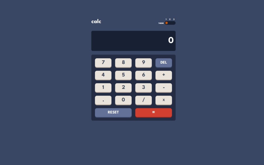
responsive calculator app using html, css and javascript
Design comparison
Solution retrospective
-
Responsive Design: The calculator is designed to be responsive and adapts well to different screen sizes, including mobile devices. This ensures a good user experience across various devices.
-
Theme Toggle Feature: Implementing the theme toggle functionality allows users to switch between three different themes, enhancing the visual appeal and usability of the calculator. The smooth transition of the toggle button and the changes in color schemes for different themes are well-executed.
-
User Interface Design: The calculator's layout is clean and intuitive, with easily accessible buttons and a readable display. The use of CSS for styling, including hover and active states for buttons, improves the overall interactivity.
-
Functional JavaScript: The JavaScript code effectively handles basic calculator operations like addition, subtraction, multiplication, and division, along with additional functions such as deleting the last input, clearing the display, and handling errors .
-
Enhanced Error Handling: Currently, the calculator displays 'Error' for any invalid operations. I would enhance the error handling to provide more specific error messages and possibly highlight the erroneous input.
-
Additional Features: Adding more advanced features like scientific functions (square root, exponentiation), memory functions (M+, M-, MR), and history of calculations would make the calculator more versatile.
-
Performance Optimization: Although the current implementation is functional, optimizing the performance by reducing redundant DOM manipulations and ensuring efficient event handling could improve the responsiveness
-
Responsive Design:
-
Challenge: Ensuring that the calculator layout adapts well to different screen sizes was challenging, particularly for very small screens where the buttons and display could become too cramped.
-
Solution: I used CSS media queries to adjust the layout, font sizes, and button spacing for smaller screens. This ensured that the calculator remained usable and visually appealing across a range of device sizes.
-
Theme Toggle Implementation:
-
Challenge : Implementing a smooth and intuitive theme toggle functionality that transitions between three different themes required careful management of CSS classes and styles.
-
Solution: I created separate CSS classes for each theme and used JavaScript to toggle these classes on the body element. This approach made it easy to switch themes and maintain a clean separation of styles for each theme
- Theme Toggle Optimization: The theme toggle functionality works, but it could be optimized for better performance and smoother transitions.
- Help Needed: How can I optimize the theme toggle functionality for better performance?
- The Floating point number calculation: need help with handling floating number calculation for better results
Community feedback
- P@Wannika123Posted 9 months ago
Congratulations on finishing the challenge!
Your code is pretty easy to read, that's quite an achievement already. And
READMEfile is very helpful and full of appreciation.For your question about float point number, you can do something like:
Math.round(1000000000000 * eval(display.value)) / 1000000000000The number of zero is up to how many decimal places you want to have.
And you might want to have this line outside of functions.
const display = document.getElementById('display');Declare
displayas a global variable, so that it can be used by every function.And your solution of Theme Toggle is actually interesting. But that way, the number label doesn't corporate with the theme. I recommend you to have a look at this code, it's how to build a toggle button that functions as it's supposed to be.
Marked as helpful0
Please log in to post a comment
Log in with GitHubJoin our Discord community
Join thousands of Frontend Mentor community members taking the challenges, sharing resources, helping each other, and chatting about all things front-end!
Join our Discord
