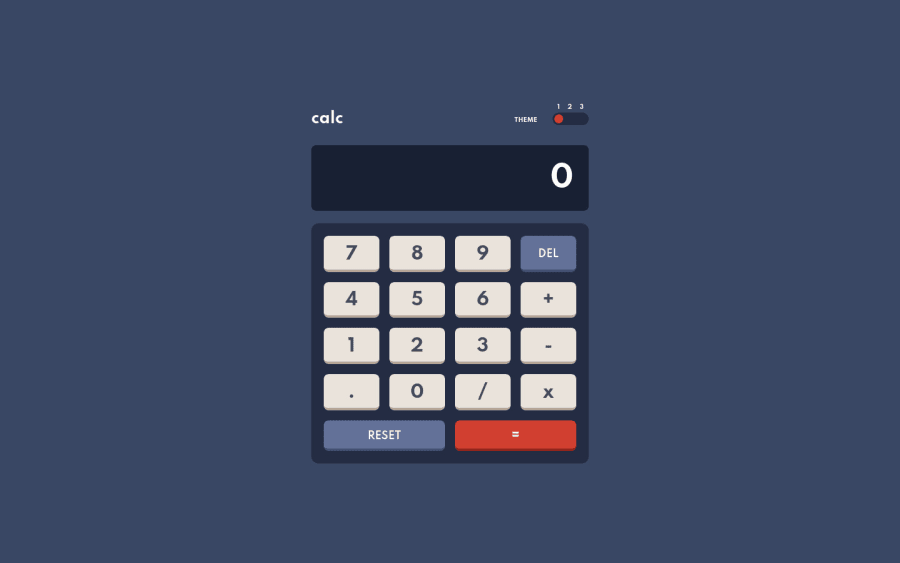
Responsive Calculator App using Grid, Flexbox & Vanilla Js.
Design comparison
Solution retrospective
I do believe that my operations are a little bit messy, but they are good at what they are meant to do. Because of my "calculations.js" file is full of if & else, the app is not the most agile. As long as you give enough time (absolutely not even a second) for my buttons to work, they will do what you want them to.
And also, I later figured out that I've got problems with negative numbers because I'm using "-" as a slicing point. I will fix it, promise.
I'm sure the operations can be improved, and I want to spend some time on them soon, and absolutely any feedback is also would be very welcome.
Community feedback
- Account deleted
This comment was deleted 5 months ago
0@doganfurkanPosted almost 2 years ago@aramfilak Are you talking about the button you press going down and losing border-bottom? If so, I did it on purpose to make it seem like you are really pressing a button. It should be only one button moving and any other component isn't. Isn't this the case?
0@doganfurkanPosted almost 2 years ago@aramfilak Yes, you are right. I had never seen that, but after you pointed it out, I changed the scale in windows settings and saw what you said. That Windows and its scale problems :( Just like you said using box-shadow and translateY seems working. Thanks a lot. While working on it, I found a couple more bugs too. You know the saying: "The more you f.ck around, the more you find out" :)
0
Please log in to post a comment
Log in with GitHubJoin our Discord community
Join thousands of Frontend Mentor community members taking the challenges, sharing resources, helping each other, and chatting about all things front-end!
Join our Discord
