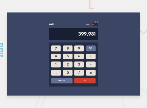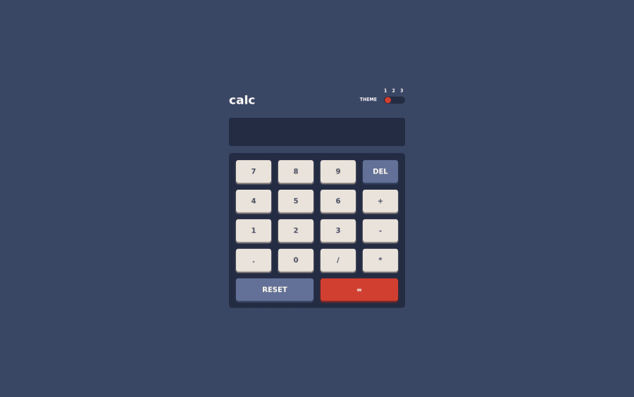
Design comparison
Solution retrospective
This project was definitely not in my comfort zone, but I gave it my best shot and I love how it turned out. What do you think about my project?
Community feedback
- @elaineleungPosted about 2 years ago
Hi Emeghiebo, great job challenging yourself to go outside your comfort zone; I think this was a very good attempt, and it's quite functional, which is great! 🙂
In terms of the UI, I think you can try making the font size of the buttons bigger, and I'd also add a
cursor: pointer
to all clickable elements. For the JS, I like how minimal the code is for the calculations; what did take up a lot of space is the adding/removing of classes on multiple elements. One suggestion I have for this, instead of needing to add/remove classes on all these elements, you can use the class you added to the body to apply the styles to all elements, since the body is the parent to all these elements. Once you have the class on the parent, you can just easily write out the CSS like this in the JS you won't have to write three extra lines for adding/removing classes:CSS .theme1 .calculator { // styles here } .theme1 .toggleSwitch { // styles here } .theme1 .showCalc{ // styles here } JS theme1.addEventListener('click', () => { document.querySelector('body').classList.toggle('theme1') document.querySelector('body').classList.remove('theme2') document.querySelector('body').classList.remove('theme3') })
Great job here, and looking forward to more challenges 😊
Marked as helpful0 - @chizobaemeghieboPosted about 2 years ago
Thank you so much for this helpful feedback. I'll do well to incorporate it in future projects.
0
Please log in to post a comment
Log in with GitHubJoin our Discord community
Join thousands of Frontend Mentor community members taking the challenges, sharing resources, helping each other, and chatting about all things front-end!
Join our Discord