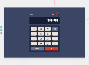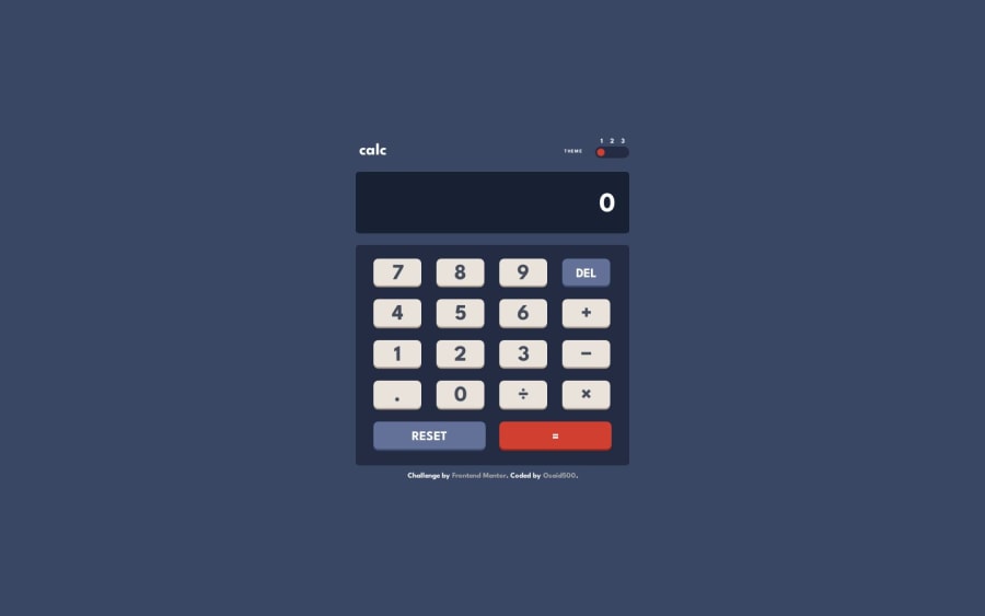
Design comparison
Solution retrospective
- Are there any potential improvements in my code structure?
- What best practices should I consider for a more efficient implementation?
- Any recommendations for enhancing the overall user experience?
- Are there alternative approaches or advanced techniques I could explore?
Community feedback
- @bbsmoothdevPosted 11 months ago
Hey, this is really nice. I am impressed with the responsiveness. I was able to set my browser view port width to
1280px
and zoom in400%
and nothing broke. You also used actualbutton
elements for the buttons which makes this keyboard accessible. You'd be surprised how many people don't do that with projects like this. And you even put anaria-live="polite"
on the display. I was not expecting that. Great job!I do have a couple of accessibility suggestions. The primary one being that the theme switcher is not keyboard accessible. The first thing that comes to mind is to use
<input type="range" min="1" max="3>
. Make sure to wrap "THEME" in alabel
and then use thefor attribute
to associate it with the range. You can keep the number above the range as you have and even make them clickable if you like, but you'll want to hide them from screen readers and other assistive technology by usingaria-hidden="true"
.The other thing I would recommend is using the appropriate HTML mathematical entities for the operators:
minus:
−
plus:+
divide:÷
multiply:×
equals:=
Screen readers will know how to announce them properly. Right now, the screen reader I am using (NVDA) does not announce anything for your current minus sign and for the multiply button it announces "x", which screen reader users will probably know means multiply, but why not use something to make that clearer? You should be able to plug and play all of these except the division operator, which will look more like a traditional division operator you learned in grade school instead of the slash. A good designer would make this trade-off for accessibility, but if they insist on the slash then you could use CSS to position the slash over the top of the button.
Again, great job on this.
Marked as helpful1@osaid500Posted 11 months ago@bbsmoothdev Thank you very much, i really appreciate it that you took your time to review my code. I'll definitely try fixing it soon and keep what you said in mind for the next projects. Very helpful!
0
Please log in to post a comment
Log in with GitHubJoin our Discord community
Join thousands of Frontend Mentor community members taking the challenges, sharing resources, helping each other, and chatting about all things front-end!
Join our Discord