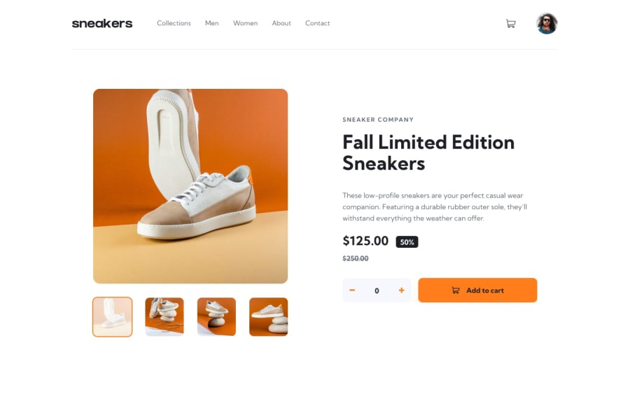
Responsive brand landing page using tailwindcss
Design comparison
Solution retrospective
I couldn't build the gallery lightbox, and the code to make the cart menu is terrible did not find the logic to work it out.
Community feedback
- @AdrianoEscarabotePosted about 2 years ago
Hi Abdulsalam Abubakar Imam, how are you?
I really liked the result of your project, but I have some tips that I think you will like:
1- Document should have one main landmark, you could have put all the content inside the
maintag click here2- All page content should be contained by landmarks, you can understand better by clicking here: click here
We have to make sure that all content is contained in a reference region, designated with HTML5 reference elements or ARIA reference regions.
Example:
native HTML5 reference elements:
<body>
    <header>This is the header</header>
    <nav>This is the nav</nav>
    <main>This is the main</main>
    <footer>This is the footer</footer>
</body>
ARIA best practices call for using native HTML5 reference elements instead of ARIA functions whenever possible, but the markup in the following example works:
<body>
     <div role="banner">This is the header</div>
     <div role="navigation">This is the nav</div>
     <div role="main">This is the main</div>
     <div role="contentinfo">This is the footer</div>
</body>
It is a best practice to contain all content, except skip links, in distinct regions such as header, navigation, main, and footer.
Link to read more about: click here
2- Why it Matters
Navigating the web page is far simpler for screen reader users if all of the content splits between one or more high-level sections. Content outside of these sections is difficult to find, and its purpose may be unclear.
HTML has historically lacked some key semantic markers, such as the ability to designate sections of the page as the header, navigation, main content, and footer. Using both HTML5 elements and ARIA landmarks in the same element is considered a best practice, but the future will favor HTML regions as browser support increases.
Rule Description
It is a best practice to ensure that there is only one main landmark to navigate to the primary content of the page and that if the page contains iframe elements, each should either contain no landmarks, or just a single landmark.
Link to read more about: click here
The rest is great!!
Hope it helps...👍
Marked as helpful1 - @denieldenPosted about 2 years ago
Hi Abdulsalam, congratulations on completing the challenge, great job! 😁
To build the gallery lightbox read here
Some little tips for optimizing your code:
- remove all
marginfromheaderand the firstdivinside it and increase thepadding - add
maintag and wrap the main content of page for improve the Accessibility - instead of using
marginto thedivcontainer of page content usewidthproperty andmargin-inlineto center the content into the page imgelement must have analtattribute, it's very important!- add
transitionon the element with hover effect - remove
background-colorfrom quantity and setcolor: whitetobutton
Hope this help! Happy coding 😉
0 - remove all
Please log in to post a comment
Log in with GitHubJoin our Discord community
Join thousands of Frontend Mentor community members taking the challenges, sharing resources, helping each other, and chatting about all things front-end!
Join our Discord
