Submitted over 3 years ago
responsive bookmark web using react JS and material ui
@akalizk113
Design comparison
SolutionDesign
Community feedback
- @iadefidipePosted over 3 years ago
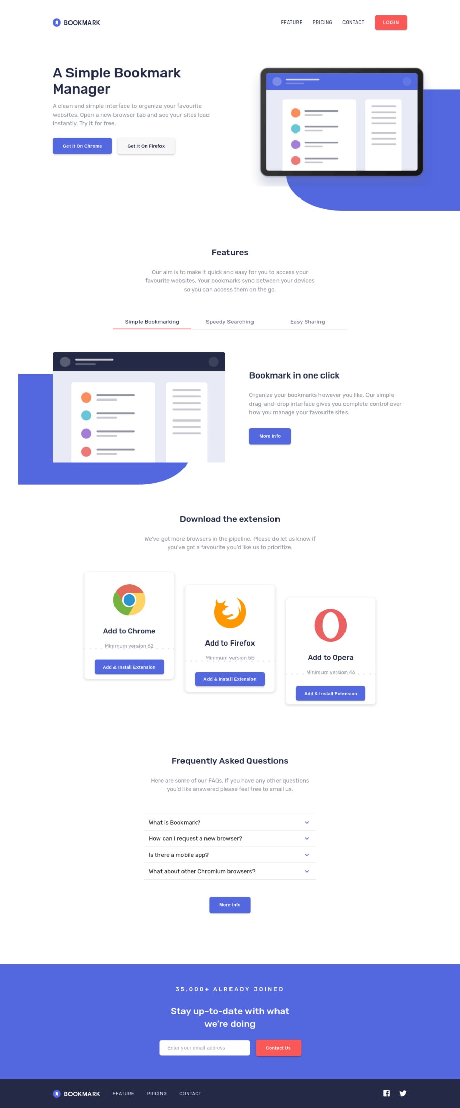
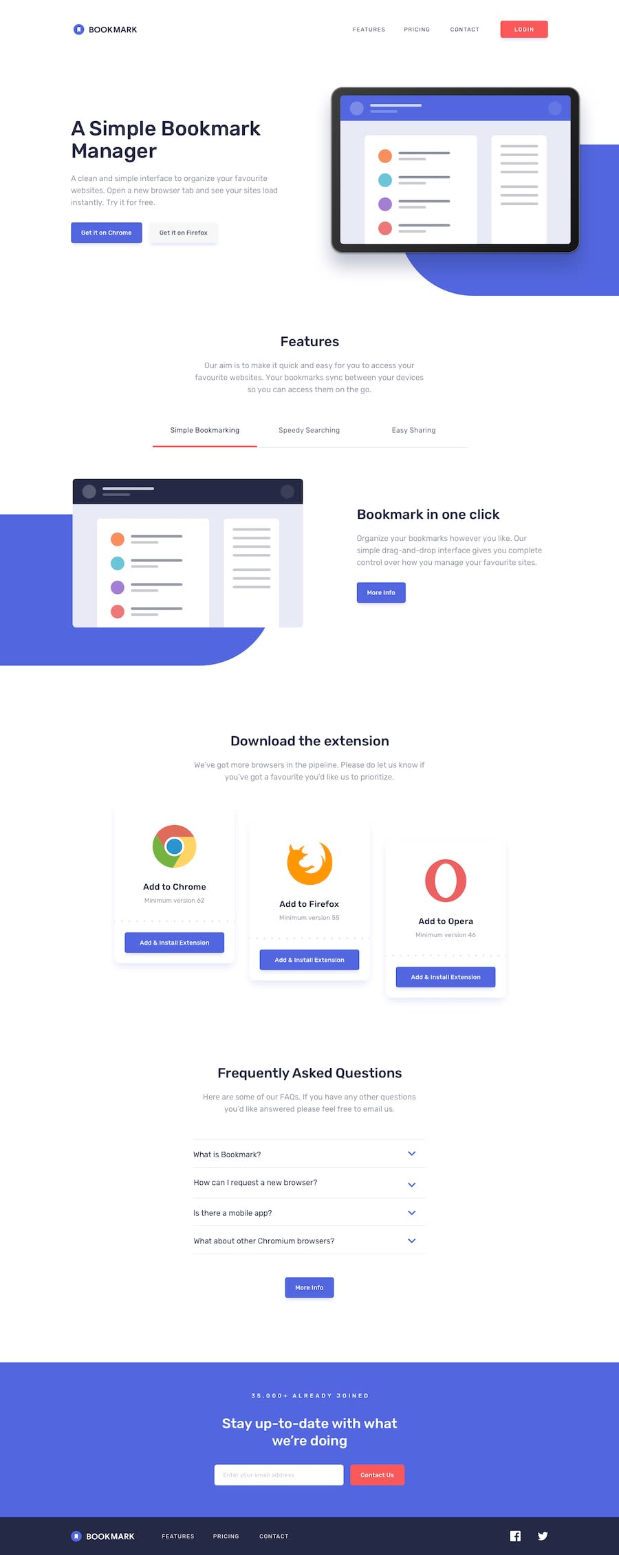
Great work @akalizk113! Just two improvements, I think you could make:
- the placements of the page illustrations is not according to the design specification, or it might be my browser. Your hero section appears not to be not flexed in the desktop view, but the solution screenshot it looks flexed. Maybe you should check your work across different browsers
- the faq accordion can be improved on by ensuring once any section of the accordion is opened others are closed, no two sections can be opened at the same time. I think it will make for better user experience. Other than that, your implementation appears to be perfect. Cheers🐱👤
Marked as helpful1@akalizk113Posted over 3 years ago@iadefidipe Thank you very much for your feedback, I have noticed the problem you mentioned, I will try to fix it.
0
Please log in to post a comment
Log in with GitHubJoin our Discord community
Join thousands of Frontend Mentor community members taking the challenges, sharing resources, helping each other, and chatting about all things front-end!
Join our Discord
