Submitted over 1 year ago
Responsive bookmark manager page using React and Tailwind CSS
#react#tailwind-css

P
@alfiemitchell123

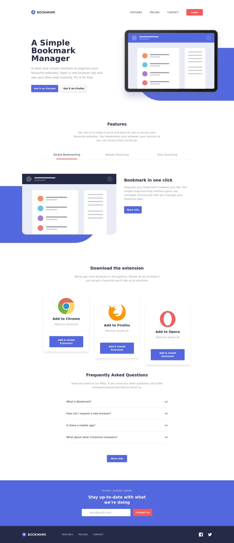
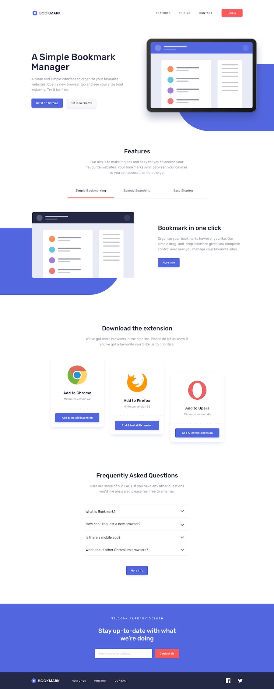
Design comparison
SolutionDesign
Solution retrospective
After spending a few weeks on this, I'm proud of how it turned out! I learned a lot about using React and Tailwind in this project and using a mobile-first workflow.
My main struggle with this project was browser responsiveness with SVGs and the blue shapes. I could style the layout to look how I wanted it to at each breakpoint, but the SVGs and the blue shapes don't look right when the viewport width is between those breakpoints. What are the best practices for designing with every viewport width in mind?
Community feedback
Please log in to post a comment
Log in with GitHubJoin our Discord community
Join thousands of Frontend Mentor community members taking the challenges, sharing resources, helping each other, and chatting about all things front-end!
Join our Discord