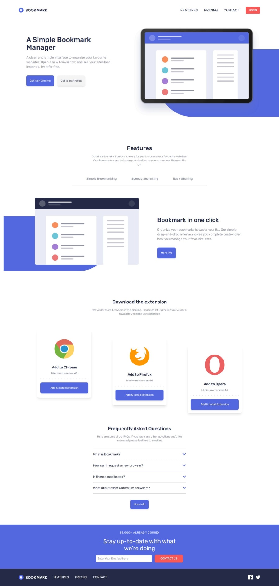


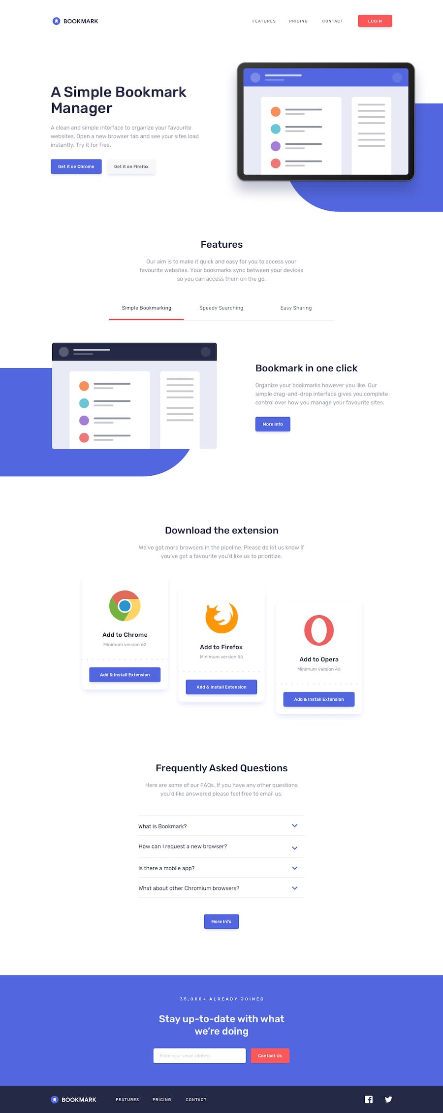
Design comparison
Please log in to post a comment
Log in with GitHubCommunity feedback
- P@elisilk
Hi 👋 @Sandaruwan7056,
Congrats on another excellent solution. 👏
I really love how you implemented transitions with the changing of colors and the scaling on hover of the articles in the extension area section. I think the transitions were very nicely done.
If you are up for diving in 🤿 a little further, here are a couple small things I noticed:
-
There were a couple of places where I noticed that the letter spacing of the text could be adjusted to better match the design. For example, the navigation links and the "35,000+ already joined" in the footer both have fairly large letter spacing in the design (1.5-2.31px and 5px, respectively). In Tailwind, you can use "arbitrary values" to set those to be larger than what is set as the default on the
tracking-widestsetting. Or "customizing your theme" is another good option. -
In your Features section, I'd suggest making
aria-selected="true"by default on the first "Simple bookmarking" link in the features section so that that first button shows the red active bar when the page is first loaded.
Anyway, just some ideas to consider if you are thinking about improving on your solution. 🤔
Great job overall! Happy coding. 💻
Eli (@elisilk)
Marked as helpful -

Join our Discord community
Join thousands of Frontend Mentor community members taking the challenges, sharing resources, helping each other, and chatting about all things front-end!
Join our Discord