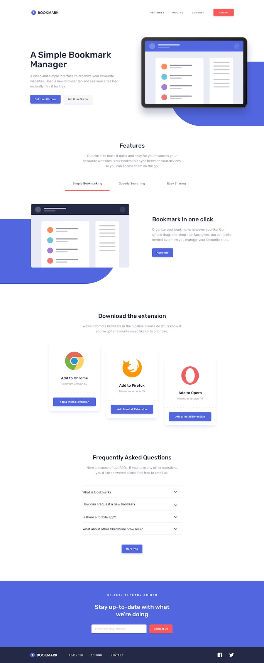
Design comparison
SolutionDesign
Solution retrospective
Looking back at the project, the biggest headaches were caused by the blue background img positioning. Would love to hear how other devs would position the background. Any other feedback welcome too.
Community feedback
Please log in to post a comment
Log in with GitHubJoin our Discord community
Join thousands of Frontend Mentor community members taking the challenges, sharing resources, helping each other, and chatting about all things front-end!
Join our Discord
