Responsive bookmark landing page created with HTML,CSS and JS
Design comparison
Solution retrospective
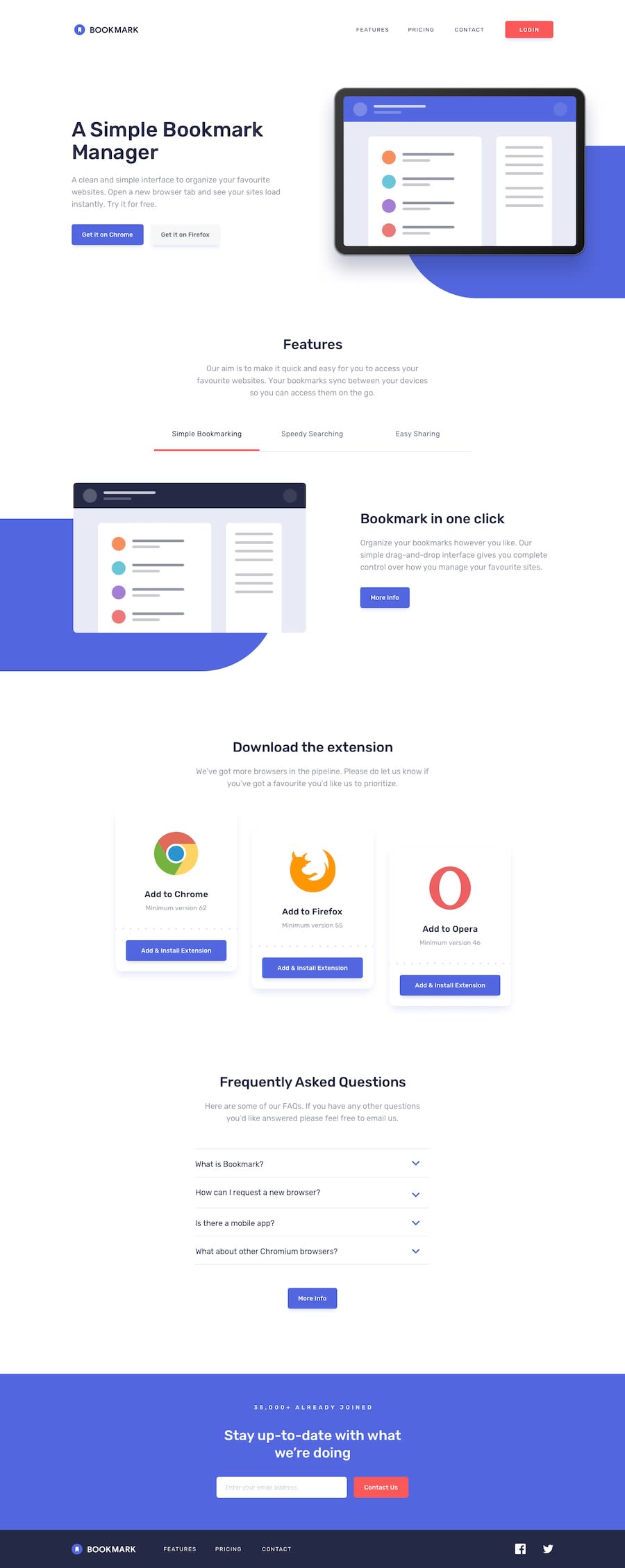
Hi guys am finally back with a new project. I spent five days on this project, and I don't really know if it has really taken me so long to complete this project, but let me know if It has....haha. but I really appreciate the fact that I completed it. my questions is, I used HTML headings in reducing order but in this project the headings are more than the [ h1....h6 ] tags that we currently have in HTML. And repeating <heading> tags is a semantic issue so I decided to use spans as <headings> for some sections, Although this fixed all the issues being reported. Is it a good practice or there is another way. I really need your opinions on how responsive this project is and feel free to share your thoughts on what I could have done to improve anything else or anything you suggest on this project. have a nice day guys.
Community feedback
- @bajra03Posted about 2 years ago
Hi Kamasah,
Small thing i got in FAQ section. When i expand more than 1 FAQ, and i collapse only 1 FAQ, the other expanded item icon have changed also.
Thank you. Happy coding!
0@Kamasah-DicksonPosted about 2 years ago@bajra03 I also noticed that ill find a way to solve that soon
0
Please log in to post a comment
Log in with GitHubJoin our Discord community
Join thousands of Frontend Mentor community members taking the challenges, sharing resources, helping each other, and chatting about all things front-end!
Join our Discord
