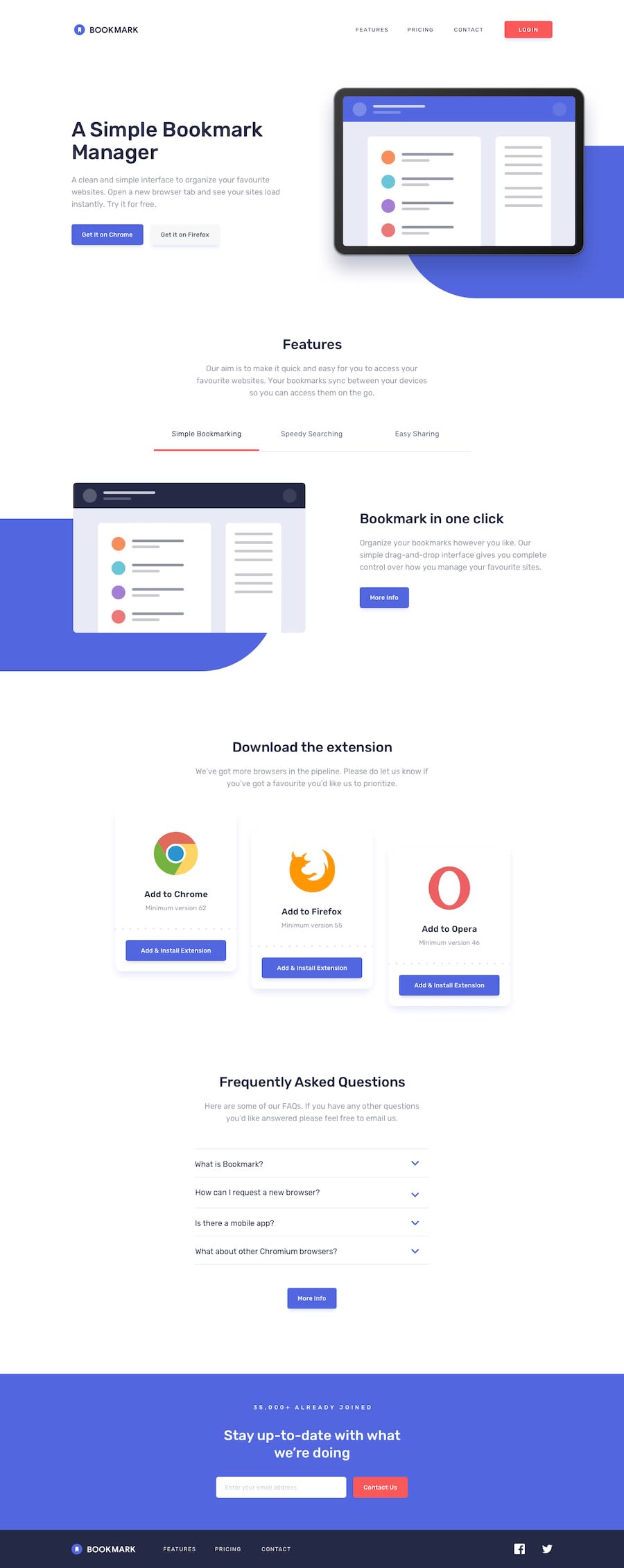
Design comparison
SolutionDesign
Solution retrospective
Any feedback is welcome.
Community feedback
- @shashreesamuelPosted over 2 years ago
Hey good job completing this challenge, keep up the good work
Your solution looks great however I think your tabbed under the features section is not supposed to have such a dark background
I hope this helps
Cheers Happy coding 👍
0
Please log in to post a comment
Log in with GitHubJoin our Discord community
Join thousands of Frontend Mentor community members taking the challenges, sharing resources, helping each other, and chatting about all things front-end!
Join our Discord
