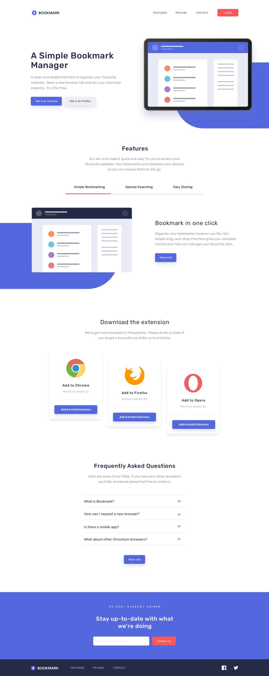
Design comparison
SolutionDesign
Solution retrospective
What are you most proud of, and what would you do differently next time?
This was absolutely a great challenge🤩 ! Here are a few things I learned and reinforced;
- Conditional Rendering
- Form validation
- Destructuring
- State Management
- Modal Pop up
- CSS responsiveness(Navbar)
I later realized that I had made a poor decision in setting the image's background container, which forced me to use multiple media queries and I don't think that's a good practice.
Trying to achieve pixel perfection without Figma files is a pain and consumes a lot of time, so I think getting the Pro version would be better! 😂
Community feedback
Please log in to post a comment
Log in with GitHubJoin our Discord community
Join thousands of Frontend Mentor community members taking the challenges, sharing resources, helping each other, and chatting about all things front-end!
Join our Discord
