Submitted over 1 year ago
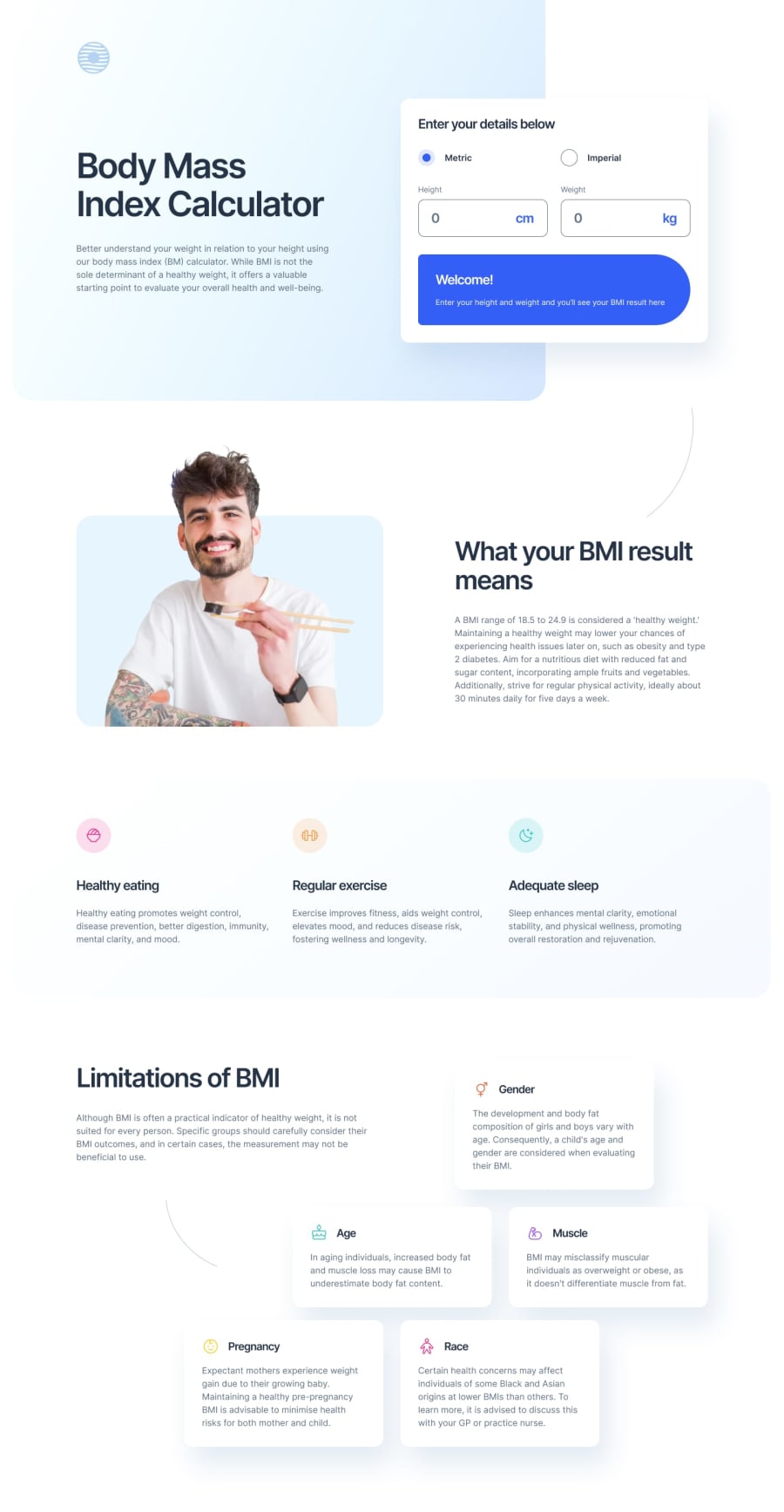
Responsive BMI Calculator
#bem#react#sass/scss#vite#accessibility
@semperprimum
Design comparison
SolutionDesign
Solution retrospective
Heyo, everyone!
I have some questions and I would greatly appreciate your feedback!
- I'm unsure about a calculator component having an absolute positioning on desktops. Because a user can switch units to imperial and the whole layout would shift. Absolute positioning prevents that.
- Cards in the "Limitations of BMI" sections also have absolute positioning. I really tried to use grid, but i felt like absolute positioning would be easier and less frustrating to use..
- The curved lines. I'm not really sure if that's how you use SVGs for the background in React (
background-imagein the CSS file doesn't work). SeeApp.jsxand/components/Description.jsxto see what I mean /components/Calculator.jsxmight be too long? I think i could've handled input change inside of the Input component, same with the radio buttons?
Community feedback
Please log in to post a comment
Log in with GitHubJoin our Discord community
Join thousands of Frontend Mentor community members taking the challenges, sharing resources, helping each other, and chatting about all things front-end!
Join our Discord
