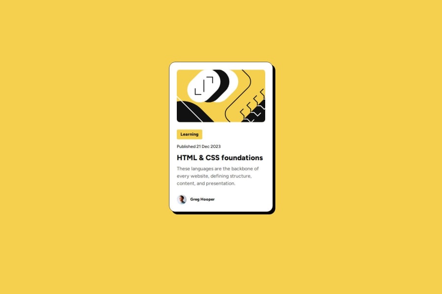
Design comparison
Solution retrospective
I'm proud of that i chose to be frontend devoleper
What challenges did you encounter, and how did you overcome them?challenges like lack of practice , but when i found this cite i am decreasing it
What specific areas of your project would you like help with?nothing yet
Community feedback
- @Grimm-NPosted 8 days ago
Hey, awesome work! 🎉 I love the structure and creativity you’ve put into this. Really solid start!
A few quick pointers to make things even better:
-
Using
<header>
for the card placement isn’t ideal. Headers are generally meant for introductory or navigational content, so screen readers might be a bit confused seeing your card there. Instead, try placing the card in a<main>
or<section>
, which better suits content blocks. -
When setting dimensions, try using units like rem, em, or % instead of pixels. These are more flexible and adapt to different screen sizes and user settings, which is key for responsive design!
-
Be sure to give each element a class! It’s not just for easy styling with CSS—it also makes your code more modular and understandable, especially for other developers (and your future self!). Using classes lets you easily apply consistent styles or scripts across similar elements.
You’re definitely on the right track! Keep it up, can’t wait to see where you take this!
Marked as helpful2@OmiromirPosted 6 days ago@Grimm-N thx u so much, i appreciate your sincere feedback for me and i'll try my best to better
0@Grimm-NPosted 6 days ago@Omiromir Hey, U R very welcome 😁We're all here to help each other by reviewing and improving our code together—teamwork makes the dream work!
0 -
Please log in to post a comment
Log in with GitHubJoin our Discord community
Join thousands of Frontend Mentor community members taking the challenges, sharing resources, helping each other, and chatting about all things front-end!
Join our Discord