
responsive Blogr_landing_page using CSS flexbox

Design comparison

Solution retrospective
Questions
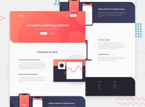
sizing svg file
i have difficulties deal with ** svg files images size** in this solution using css flexbox. Especially in sections ** for_future** and **free_open **. I don't figure out how to match size of svg files on theses sections like given in the specs.
I looked through articles based on responsiveness of svg image even like it is assumed to be easy to implement i don't fare well with these one in this first project. To link svg images to my html code i used <img tag>
Here is some snippets code of mine in css, willing to size svg file :
*** for future section***
.for_future .row .future_image {
  position: relative;
  margin-top: 2rem;
  display: flex;
  flex-direction: row;
  flex-basis: 50%;
  left: 3.2rem;
  width:1400px;
  height: 750px;
  overflow: hidden;
}
.for_future .row .future_image .fut_img{
  position: absolute;
  width:100%;
  height: 100%;
  object-fit: cover;
  overflow: hidden;
  z-index: +2;
}

*** free open section***

.free_open .row .future_image {
  position: relative;
  margin-top: 6rem;
  display: flex;
  flex-direction: row;
  flex-basis: 100%;
  right: 15rem;
  width:1400px;
  height: 700px;
  overflow: hidden;
  z-index: +2;
}
.free_open .row .future_image .fut_img{
  position: absolute;
  width:100%;
  height: 100%;
  object-fit: cover;
  overflow: hidden;
  z-index: +2;
}

***mobile screen width: 375px***

.for_future .row .future_image {
    flex-basis: 100%;
    width:100%;
    height: 100%;
    left: 0rem;
    overflow: hidden;
  }

  .for_future .row .future_image .fut_img{
    width:50%;
    height: 10%;
    overflow: hidden;

    object-fit: cover;
  }

.free_open .row .future_image {
      top: 1rem;
      left: -14rem;
      width: 800px;
      height: 100px;
      transform: scale(0.8);
    }
    .free_open .row .future_image .fut_img{
      position: absolute;
      width:75%;
      height: 60%;
      object-fit: cover;
      overflow: hidden;
      z-index: +2;
    }
Curves line to the background
I also saw some kind of curves lines surrounding the phone image in the section entitled State of the art Infrastructure , doesn't found how to make same curves lines with differents colors background like that.
Is it a product design effect built with Figma or Notion ?. And how to do it ?That are my queries.
Community feedback
Please log in to post a comment
Log in with GitHub
Join our Discord community
Join thousands of Frontend Mentor community members taking the challenges, sharing resources, helping each other, and chatting about all things front-end!
Join our Discord