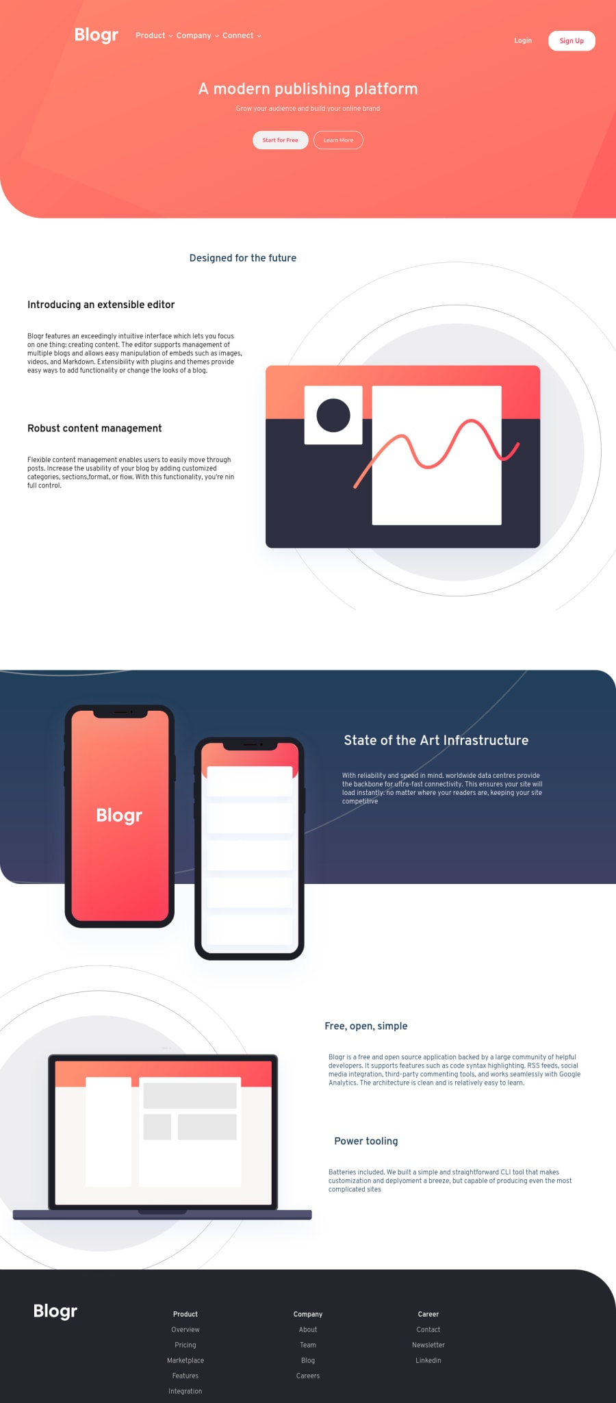
Responsive Blogr Site Using Css & Vanilla Javascript
Design comparison
Solution retrospective
I would love to get some feedback here.
This is my fifth project. I have tried my best to match the design
But I must have made some mistakes, must have done things that aren't standard practice.
If you can point those out, It would be a great help for me to get better at CSS, Flexbox, JS
Thanks a lot.
Community feedback
- @pikapikamartPosted about 3 years ago
Hey, awesome work on this one. This is my first project and I still find this really hard to be honest:>. For the layout, I had to zoom out since you are using 1440px which is too big for lots including me who uses a 1366x768, the 1440px on the design is not related to the breakpoint. Toning it down would be great since showing the mobile layout from 0-1440px is too big, don't you think.
AliAbuhumra already gave feedback on this, just going to add some suggestions as well:
- A typical structure of a site looks like this:
<header />
<main />
<footer />
This way, all content of your page will be inside their own respective landmark element. For this, the
headerwill only contain thenavbarsince theheaderwill be usingposition: absoluteso that the first section of themaincould occupy the topmost part to show the design.- Remember that a website-logo is one of the meaningful images on a site so use proper
altfor it. Use the website's name as the value likealt="sneakers". - Right now, your markup for the navbar is too complicated. What you could have looks something like this:
<nav>
 <ul>
  <li>
    <button>Product</button>
    <ul>
      { links in here }
    </ul>
  </li>
  <li> ...</li>
  <li> ...</li>
 </ul>
</nav>
You will need to have a parent
ulthat has 3lithat wraps each of the navlinks like theproduct, company, connect. Also, you don't need to use heading tag on each of those, use onlybutton.- Also, when creating interactive components, use interactive elements. For example, the dropdown, you are making the arrow-icon, an
imgto be interactive which should not be sinceimgis not designed to act that way right, that is why there arebuttonfor interactivity. - You don't need to have those
divinside theatags since you could just directly use the text-content of thedivas the text-content of theatag. - Also, when using a heading tag, make sure you are not skipping a level. If you use
h4then make sure thath1, h2, h3are all present. - Don't nest
atag insidebuttonor vice-versa. Use onlyatag itself orbutton. - Those images that are in here except for the illustration of the phone, are only decorative images. Decorative images should be hidden for screen-reader at all times by using
alt=""andaria-hidden="true"to theimgtag or onlyaria-hidden="true"if the image is usingsvg. - Only use descriptive
alton images that are meaningful and adds content to the site otherwise hide the image for screen-reader users. - When using
imgtag, you don't need to add words that relates to "graphic" such as "illustration" and others, sinceimgis already an image so no need to describe it as one. - Phone-illustration could have use a descriptive
altsince the app is being show. It could be likealt="blogr app on a phone".
FOOTER
- Same with the company logo, use a more proper
altvalue. - Again same as the proposed markup above, those links again on the bottom-part should use it. They are still you navigational links so use
navwithulthat has 3liitems and eachliwill have aulthat will contain those list-of-links.
MOBILE
- Hamburger menu should be using a
buttonsince it is an interactive component.
SUPPOSING BUTTON IS USED
- The
buttonshould have a default atribute ofaria-expanded="false"and it will be set totruewhen the users toggles it and vice-versa. - The hamburger
buttonshould have eitheraria-labelattribute orsr-onlytext inside it which defines what thebuttondoes. You could usearia-label="navigation dropdown menu" - The
imginside the hamburger-menu should have been hidden since it is only a decorative image. - Also the markup placement is wrong. The dropdown-toggle should be placed before the navbar so that after the user toggles the
buttonthe focus will be "next" to the dropdown.
Right now, html is the problem in here. You could look up for some same challenges solution on this and take note of their structuring, but do not take mine since it is not accessible and haven't refactored it yet:>
But still, great job again on this one.
0@nareshpooniaPosted about 3 years ago@pikamart Hi Raymart,
Thanks for such a detailed reply, I have fixed a few issues, for others, I am taking a note and will try to implement them in my next project.
Thanks again
1 - @aliabuhumraPosted about 3 years ago
Great job, but I have a few notes
1 - remove the tag < a herf=""> from inside button
2 - add landmarks in img like this 👉 </img>
0@nareshpooniaPosted about 3 years ago@metaalii Thanks, Ali, I have fixed the HTML issues now
0
Please log in to post a comment
Log in with GitHubJoin our Discord community
Join thousands of Frontend Mentor community members taking the challenges, sharing resources, helping each other, and chatting about all things front-end!
Join our Discord
