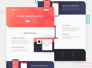
Design comparison
SolutionDesign
Solution retrospective
Second attempt. At first I did this challenge with tailwindcss, not sure if like it that much though. So I decided to redo this challenge. I played around with some animations, learned a lot. I think I did well with the dropdowns. Also, the images are different on mobile and desktop. I changed their src with js and I don't think it's the best solution, but that's all I could find about it.
Community feedback
- @denieldenPosted about 2 years ago
Hi Vasyl, you did a great job!
You can change images without using js using the
pictureelement like this:<picture> <source media="(min-width: 55em)" srcset="./img/illustration-editor-desktop.svg"> <img src="./img/illustration-editor-mobile.svg" alt="Designed for the future: extensible editor"> </picture>Hope this help !
Marked as helpful0@vasyaqwePosted about 2 years ago@denielden Thanks for that, Deniel, I will definitely try that!
1
Please log in to post a comment
Log in with GitHubJoin our Discord community
Join thousands of Frontend Mentor community members taking the challenges, sharing resources, helping each other, and chatting about all things front-end!
Join our Discord
