Design comparison
Solution retrospective
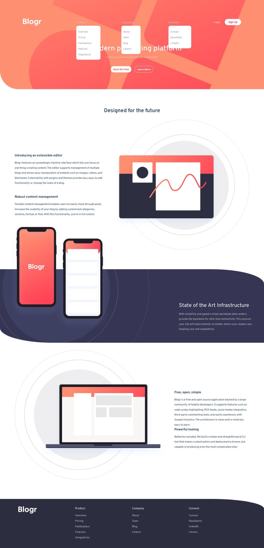
Mmm… This is my first time working on a menu for the mobile screen. I've always avoided it, but I had to face it and give it a try, which turned out nice.
What challenges did you encounter, and how did you overcome them?The major challenge I had was styling the nav bar for both mobile and desktop screens, but it was fun to work on. I had to watch several videos to understand it, although the drop-down in the design doesn't have a width of 100% like mine does. Additionally, the dropdown on both mobile and desktop screens was initially set to a position of fixed to take up the available screen space. I tried using static positioning, but it created it above the text container in the header, so I had to revert it back to fixed.
What specific areas of your project would you like help with?The functionality and responsiveness are key areas I'm struggling with, as well as positioning. I would really appreciate it if you could go through my code and provide comments on how I could improve for next time.
Community feedback
- @kodan96Posted 7 months ago
hi there! 👋👋
There's no need to create a whole new section in HTML for your mobile and desktop headers. You can wrap the dropdown lists and the corresponding main list items into a
navtag (since we're using semantic HTML) and you're free to move them around withposition: absolute;.Also, since your
eventListener()works with click it's not a good idea to give the dropdown menusposition: fixed;, because users can scroll down after opening the dropdowns.You can check my solution if you have questions, or feel free to ask me.
Hope this helps 🙏
Good luck and happy coding!
1
Please log in to post a comment
Log in with GitHubJoin our Discord community
Join thousands of Frontend Mentor community members taking the challenges, sharing resources, helping each other, and chatting about all things front-end!
Join our Discord
