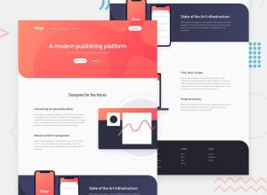
Responsive Blogr landing page using Tailwindcss
Design comparison
Solution retrospective
The 2 parts that I think are quite tricky are the hero and the state section, for the hero part the pattern is the hardest part because you have to adjust the position and size of the pattern image to match the screen size and the second state section is the same as the hero, you have to adjust the position and size of the pattern image, for the image phone mockup I recommend using relative position so that its position floats above the section , you can also use absolute but I think it's quite difficult to adjust it with flex
Not quite perfect but I quite like it
Feel free to drop any feedback .✌
Community feedback
Please log in to post a comment
Log in with GitHubJoin our Discord community
Join thousands of Frontend Mentor community members taking the challenges, sharing resources, helping each other, and chatting about all things front-end!
Join our Discord
