
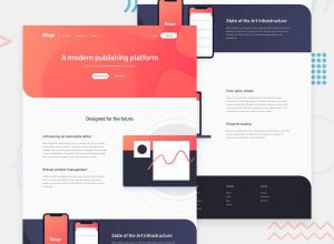
Responsive Blogr Landing page using min, max, flex, grid and BEM

Design comparison

Solution retrospective
I would like to know how I can improve the responsiveness. And if you notice anything else I can improve on, please let me know. Any feedback is greatly appreciated. Thank you! :)
Community feedback
- @AmodeusRPosted about 3 years ago
@erelita Sorry for the late replay, I would need to see it more in-depth to give you a decent answer, but a quick fix would give a max-width to the main div, though it would end up making the SVGs not touch the sides of the viewport.
It might be necessary to review/change the approach to make it work the way it is supposed in every viewport size, but I'm not sure...
0 - @AmodeusRPosted about 3 years ago
It seems your layout breaks when the viewport width gets too wide. Have you tried making a container for the content to fix it?
0@ereljapcoPosted about 3 years ago@AmodeusR Hello! Thanks for leaving a feedback :)
May I know if you're referring to the illustrations? I'm having a hard time with sizing and positioning it with wider screens. Each illustration is set as a background image of a div and it has a display absolute.
Can you let me know how I can make use of container to fix this based on my code? Would appreciate it very much :)
0

Please log in to post a comment
Log in with GitHub
Join our Discord community
Join thousands of Frontend Mentor community members taking the challenges, sharing resources, helping each other, and chatting about all things front-end!
Join our Discord