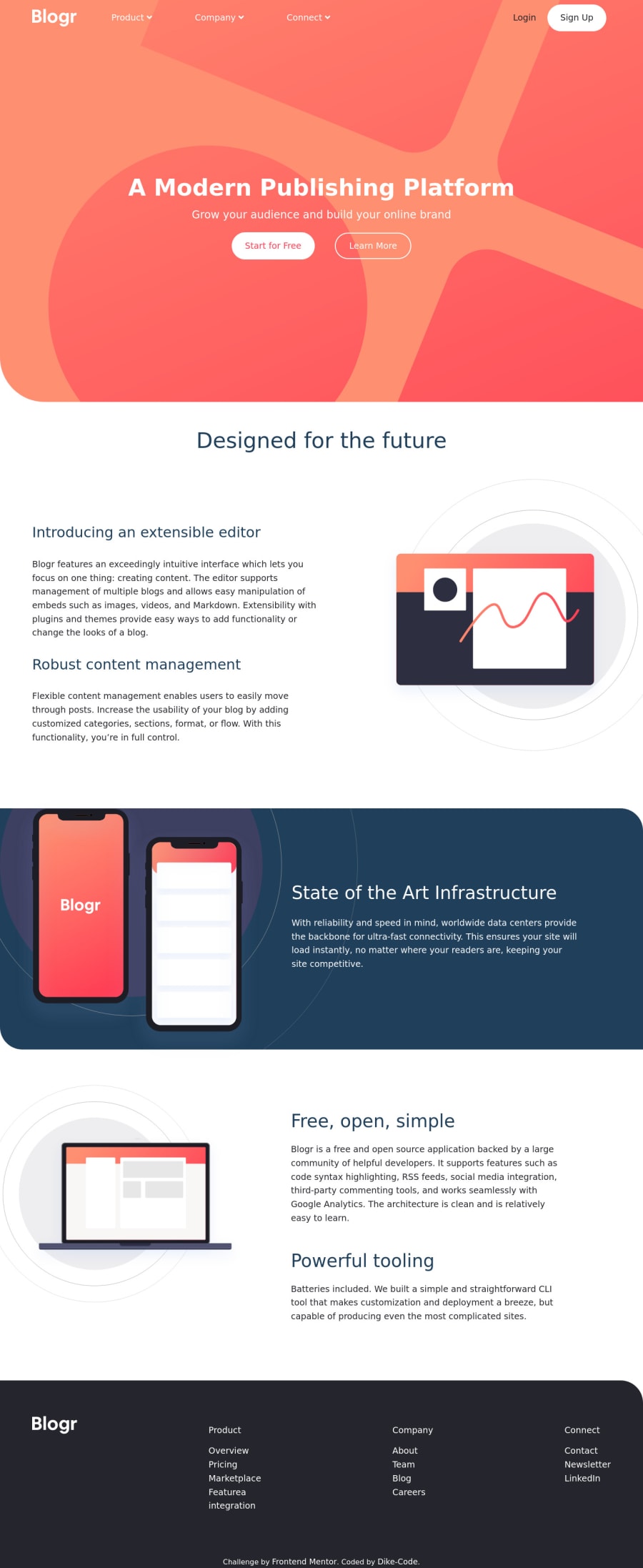
Responsive [Blogr] landing page built with HTML5, CSS3 and Javascript.
Design comparison
Solution retrospective
Hi team, I just concluded yet another challenge, and it would be a pleasure if you would take your time to review my work when you come across it and in turn drop your criqutes 🙏 so for me to know where I'm lagging and where I needs to be improve.
Community feedback
- @grmajikPosted over 3 years ago
Hi there.
-
Your header seems too big in comparison to the design.
-
Your transition for the footer links feels too slow and I can't distinguish between each category for the links. Make the "product" "contact" "connect" text a different styling. Maybe make the other links smaller ?
-
On mobile devices you can't ever "hover" on elements, so I doubt your mobile nav menu would work for these devices. Maybe you'd want to make both desktop version and mobile work on click to expand the dropdown.
Overall good job, keep on coding brother ! 💪
0@Dike-CodePosted over 3 years ago@grmajik Yeah Bro. You're pretty right with the "Header" aspect, I'd try to reduce the height to fit with the original design...
I'd also sort the transition speed coupled with click effect.
Thanks a lot man✊, I really do appreciate your feedback.
0 -
Please log in to post a comment
Log in with GitHubJoin our Discord community
Join thousands of Frontend Mentor community members taking the challenges, sharing resources, helping each other, and chatting about all things front-end!
Join our Discord
