Design comparison
SolutionDesign
Solution retrospective
What are you most proud of, and what would you do differently next time?
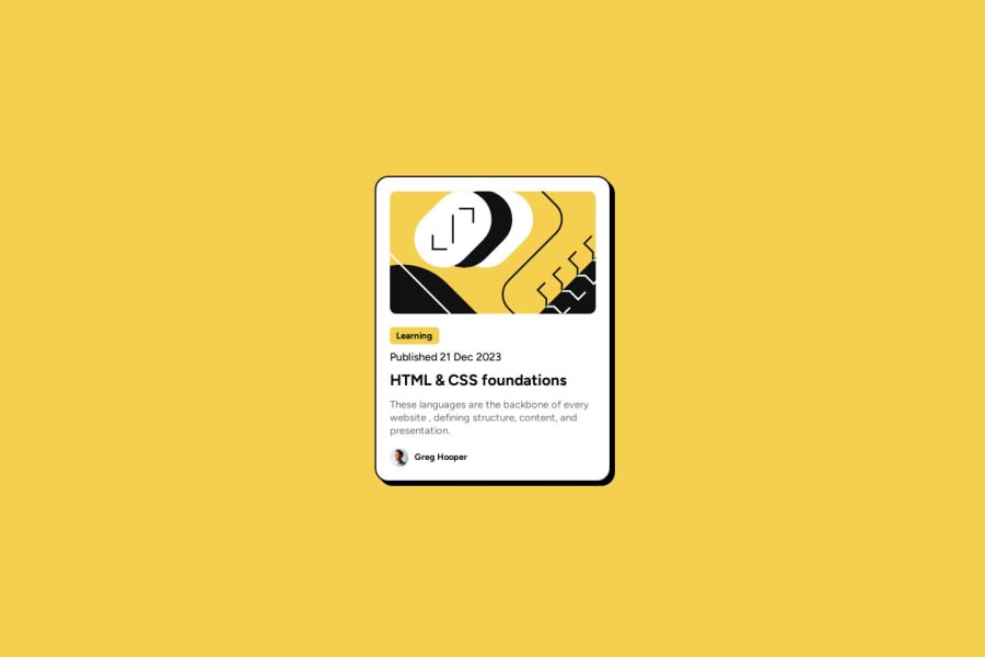
The design looks pretty similar. I would understand and apply responsive design in a better way next time.
What challenges did you encounter, and how did you overcome them?This design looked simple and is simple. But it took more time to build it
What specific areas of your project would you like help with?I need feedback on making this layout responsive so that It retains this aspect ratio on any screen.
Community feedback
- @gfunk77Posted 6 months ago
Nice job on your solution. The card looks really nice. I would suggest a few things that might help:
- You have many 'containers'. For example, you can remove the id="rounded-box-section" entirely and just put those styles on main.
- .rounded-box might make more sense being labeled as .card.
- try to avoid using fixed width and heights on elements. That removes responsiveness. So for your .rounded-box, try something like width: 90%, max-width: 345px. Let the elements inside control the height, no need to set it.
- You don't need a div for both category and publish-date. Put both the h5 and p inside one div.
- Same for heading and description, they can both go inside one div
I think you did a great job on the card. I hope this feedback is helpful to you.
Marked as helpful1
Please log in to post a comment
Log in with GitHubJoin our Discord community
Join thousands of Frontend Mentor community members taking the challenges, sharing resources, helping each other, and chatting about all things front-end!
Join our Discord
