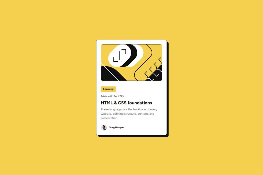
Design comparison
Solution retrospective
I am proud at my progress and would do nothing differently. I enjoyed the whole activity.
What challenges did you encounter, and how did you overcome them?I struggled with placing the contents of the card in center while maintaining the left side line-up but I figured it out. I also struggled with adjusting the blog image to the right width and height when it is under 1140px. It seems to do it's own thing and I don't know how to fix it.
What specific areas of your project would you like help with?I need help on how to adjust the svg blog image to match the specified width and height by figma(279 x 200), for a screen that is under 1140px.
Community feedback
- @Grimm-NPosted 5 months ago
Awesome work! 👏 I really love how clean and well-structured your design is – great job so far! Here are a few suggestions to make it even better:
-
Consider small screen sizes – Remember that some users may still have devices with a width of 320px. It’s a good idea to plan your design for these smaller screens as well. For example, you can set the width of your card to
90%or90vwto prevent it from sticking to the edges of the viewport. This ensures a better user experience on all devices. 📱 -
Download and use custom fonts – It’s better to download fonts and add them using
@font-facein your CSS. This gives you control over font loading speed, avoids third-party service dependencies, and ensures your design stays consistent even if the external service has issues. 💡 -
Add classes to all elements – Giving each element a class improves code readability and makes your styles reusable and scalable. It also keeps your HTML organized and avoids conflicts when styling multiple elements. Using a methodology like BEM (Block-Element-Modifier) can help create a clear and maintainable structure for your CSS. For example:
<div class="card"> <h2 class="card__title">Title</h2> <p class="card__text">Some text here</p> </div> -
Use relative units instead of pixels – Try using
remoreminstead ofpx. These units scale better for responsiveness and accessibility, especially when users zoom or have different base font sizes set in their browsers. This makes your design more user-friendly and adaptive! 🌟
Keep up the amazing work! You’re doing great! 🎉
Marked as helpful1 -
Please log in to post a comment
Log in with GitHubJoin our Discord community
Join thousands of Frontend Mentor community members taking the challenges, sharing resources, helping each other, and chatting about all things front-end!
Join our Discord
