Design comparison
Please log in to post a comment
Log in with GitHubCommunity feedback
- @jyeharry
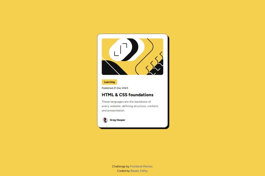
Personally, rather than having BEM class names that start with "blog", I would've continued using class names that start with "card" as they're still part of the card "block".
Instead of the card being a
<div>, I made mine an<article>to make it more semantic and accessible.Lastly, your media query which adds padding to the
<main>tag only kicks in once the screen reaches 375px, but above that the card briefly touches the edges of the screen. It might be better to just always have that padding on the container.Adding to that, you could avoid using media queries to change the font size by instead using
clamp()which makes the font size change fluidly. :)
Join our Discord community
Join thousands of Frontend Mentor community members taking the challenges, sharing resources, helping each other, and chatting about all things front-end!
Join our Discord
