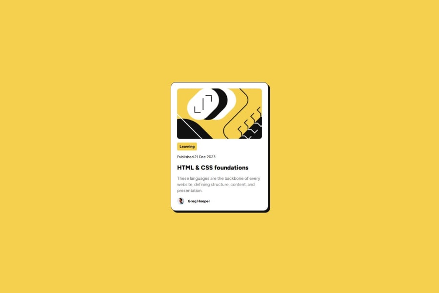
Responsive blog priview card using tailwind


Design comparison

Solution retrospective
Hello friends,
I’m Dheerendra Kumar, and I’m excited to share my journey of completing this challenge. A few days ago, I watched a Tailwind CSS course, and just before that, I had learned CSS. Instead of working with plain CSS, I decided to jump straight into Tailwind CSS (v3) and build this challenge using it. I am most proud of in compelete this challenge using Tailwind,
What challenges did you encounter, and how did you overcome them?What I Learned Through this project, I explored how to add custom CSS and create custom utilities like spacing, colors, margins, and padding. I also gained a deeper understanding of Tailwind’s unique approach—such as using hidden instead of display: none, since Tailwind doesn’t include display: none by default. These small differences helped me understand Tailwind’s philosophy better and improved my workflow.
Where I Needed Support To overcome challenges, I turned to ChatGPT for help. It guided me in:
Implementing custom properties and utilities in Tailwind CSS Exporting all Tailwind styles into a style.css file using DevTools Applying rounded borders correctly, [me: I give my written retrospective to Chatgpt for making it grammar correct and engaging] This challenge was a great learning experience, and I look forward to refining my skills further! 🚀
What specific areas of your project would you like help with?I would like to help how to make CSS utilities so that your work done faster, responsive layout design(grid and flexbox) etc. thank you reading till here
Community feedback
Please log in to post a comment
Log in with GitHub
Join our Discord community
Join thousands of Frontend Mentor community members taking the challenges, sharing resources, helping each other, and chatting about all things front-end!
Join our Discord