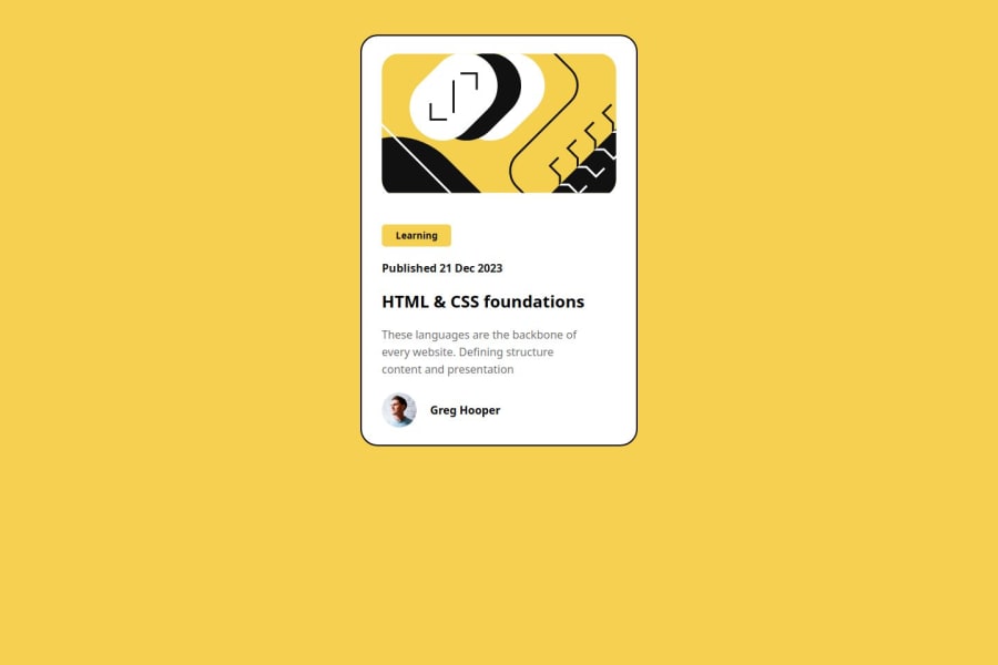
Design comparison
SolutionDesign
Community feedback
- @Xerver8694Posted 5 months ago
The HTML is very easy to read through and understand. It also appears to be accessible, as far as I can tell. The preview site looks good as well, but the styling is a little bit off from the original design, the shadows could use some more work. I struggle with CSS myself, so I am not one to talk though. Aside from that, the solution appears to meet almost of the marks.
Marked as helpful0
Please log in to post a comment
Log in with GitHubJoin our Discord community
Join thousands of Frontend Mentor community members taking the challenges, sharing resources, helping each other, and chatting about all things front-end!
Join our Discord
